-
Type of action
Branding and Packaging.
-
Target
Regional and national market positioning
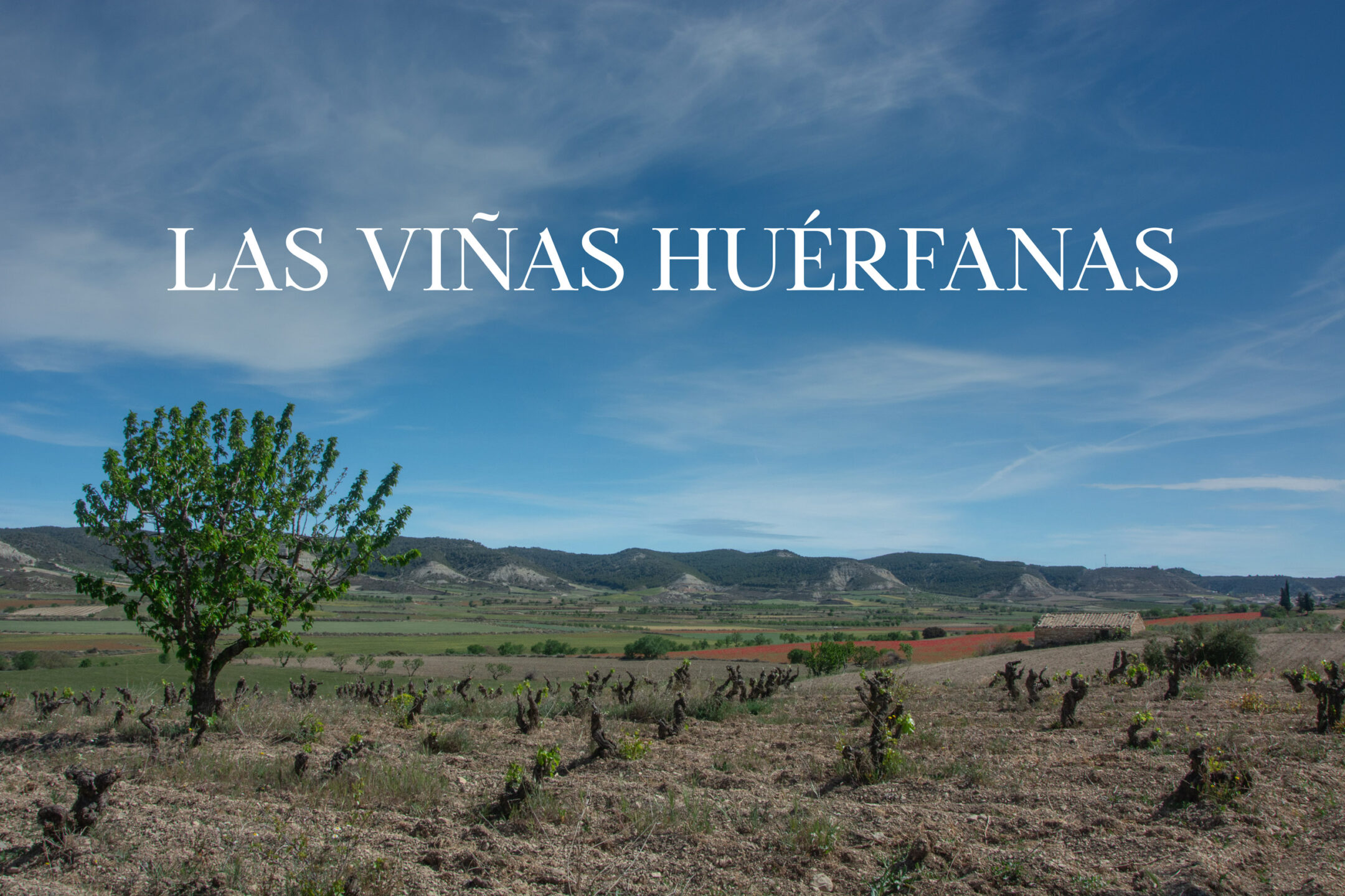
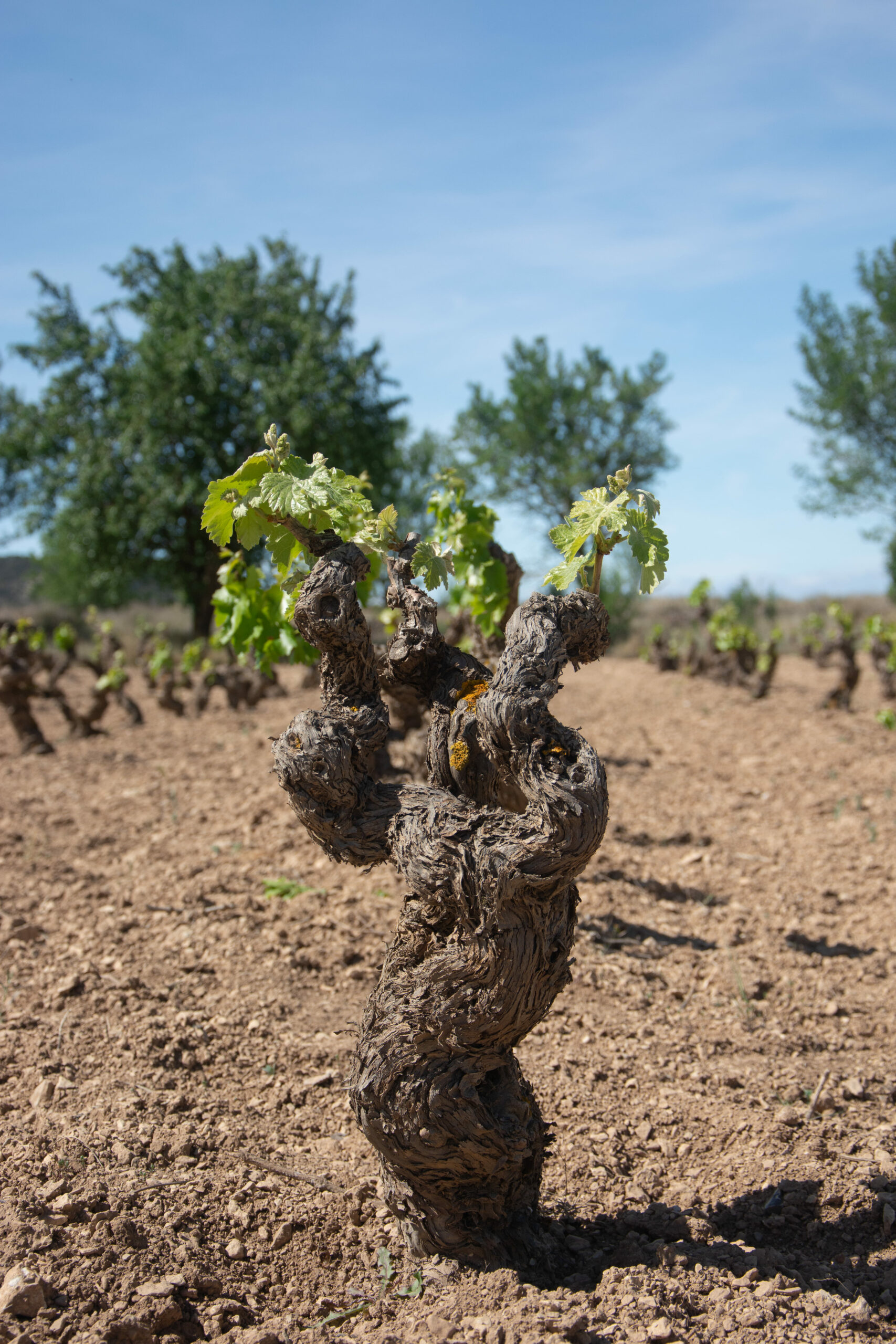
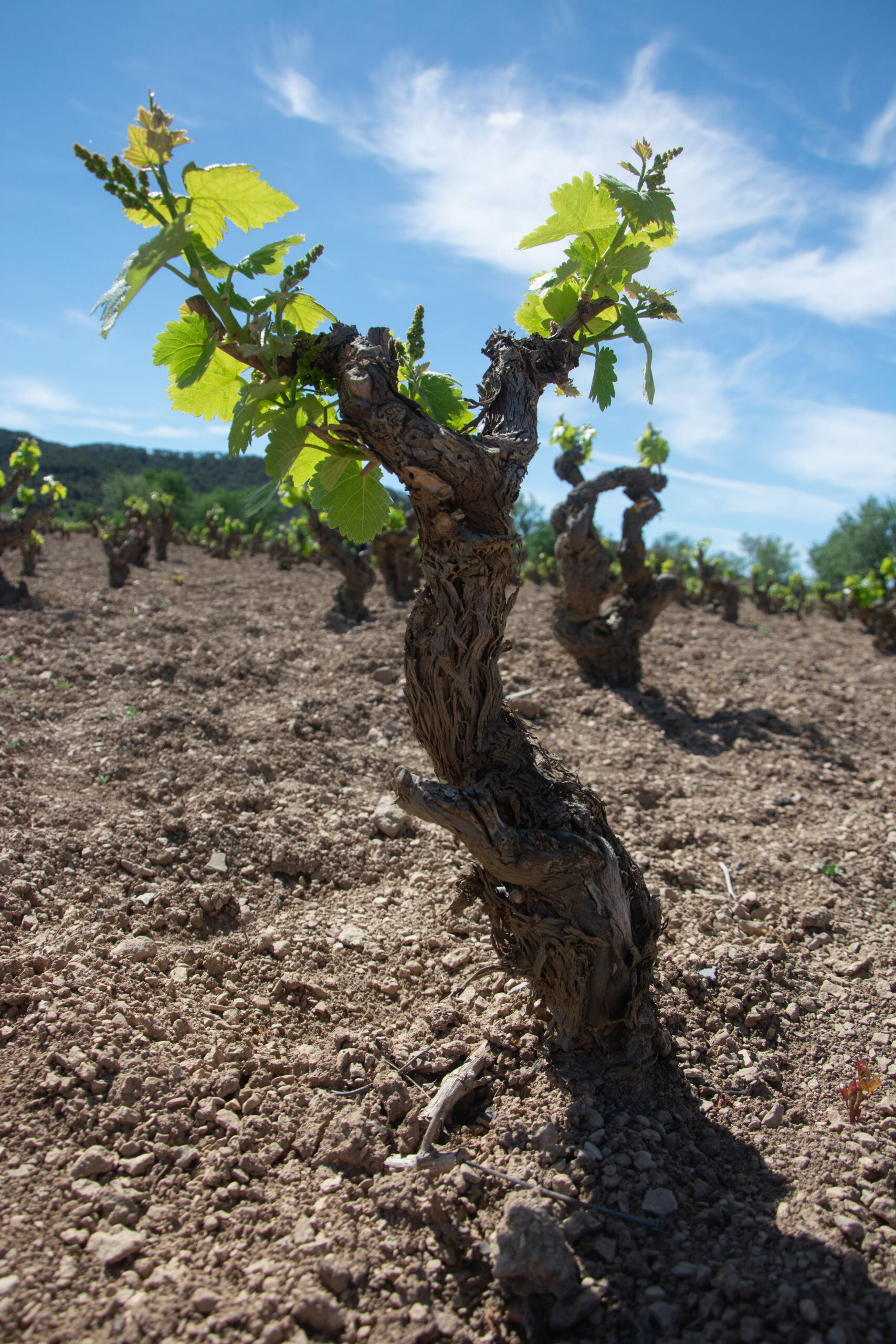
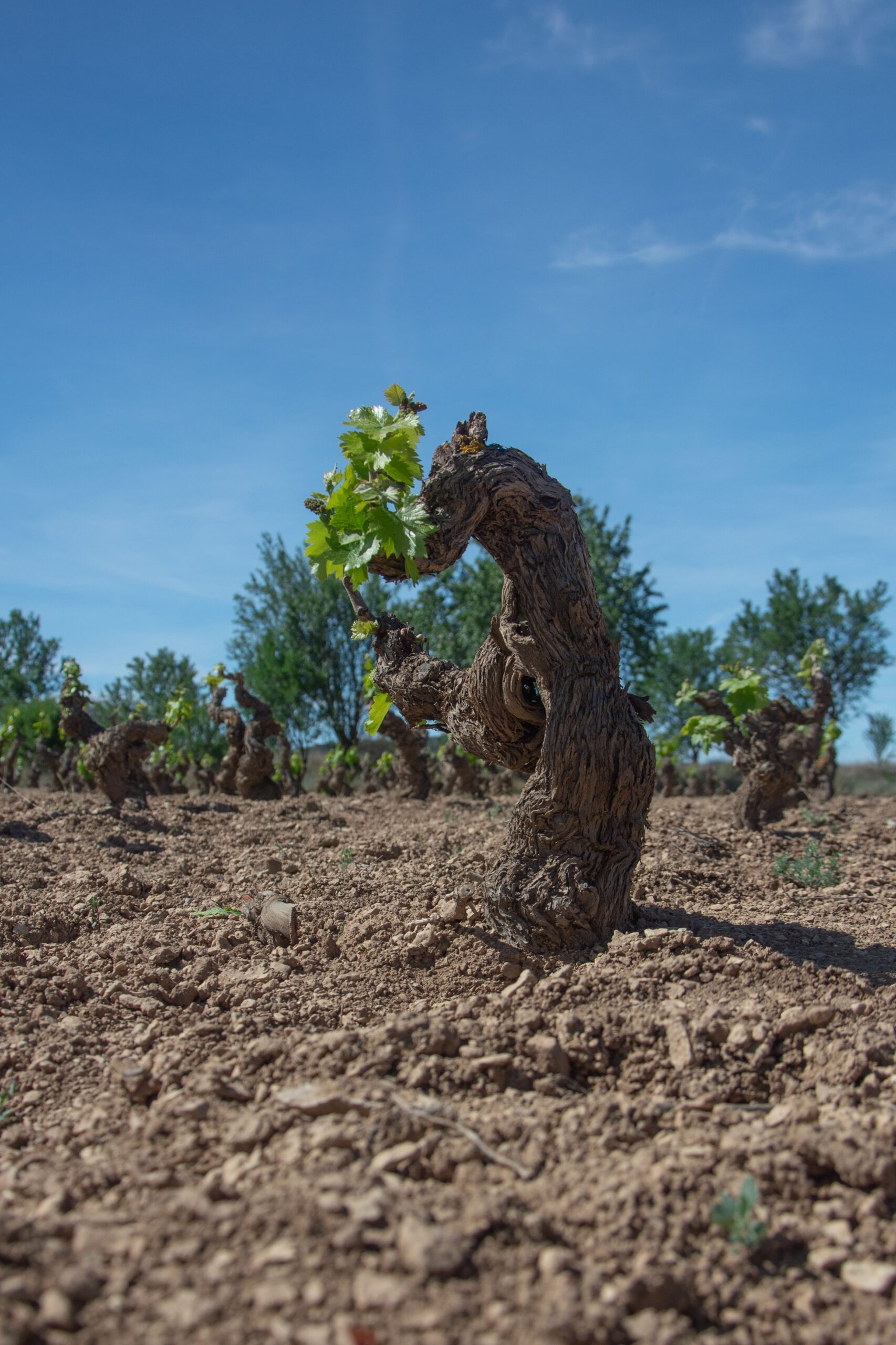
In Castejón de Valdejasa, in the north of the province of Zaragoza, they are said to live, the oldest vineyards in Aragon.
The project of the 'Viñas Huérfanas' arises when, after some time trying to market the wines without success and about to throw in the towel, the client calls us to try to give another approach, look and name for their wines and brand, with the clear objective of generating a greater insertion of their wines in the regional and national market.
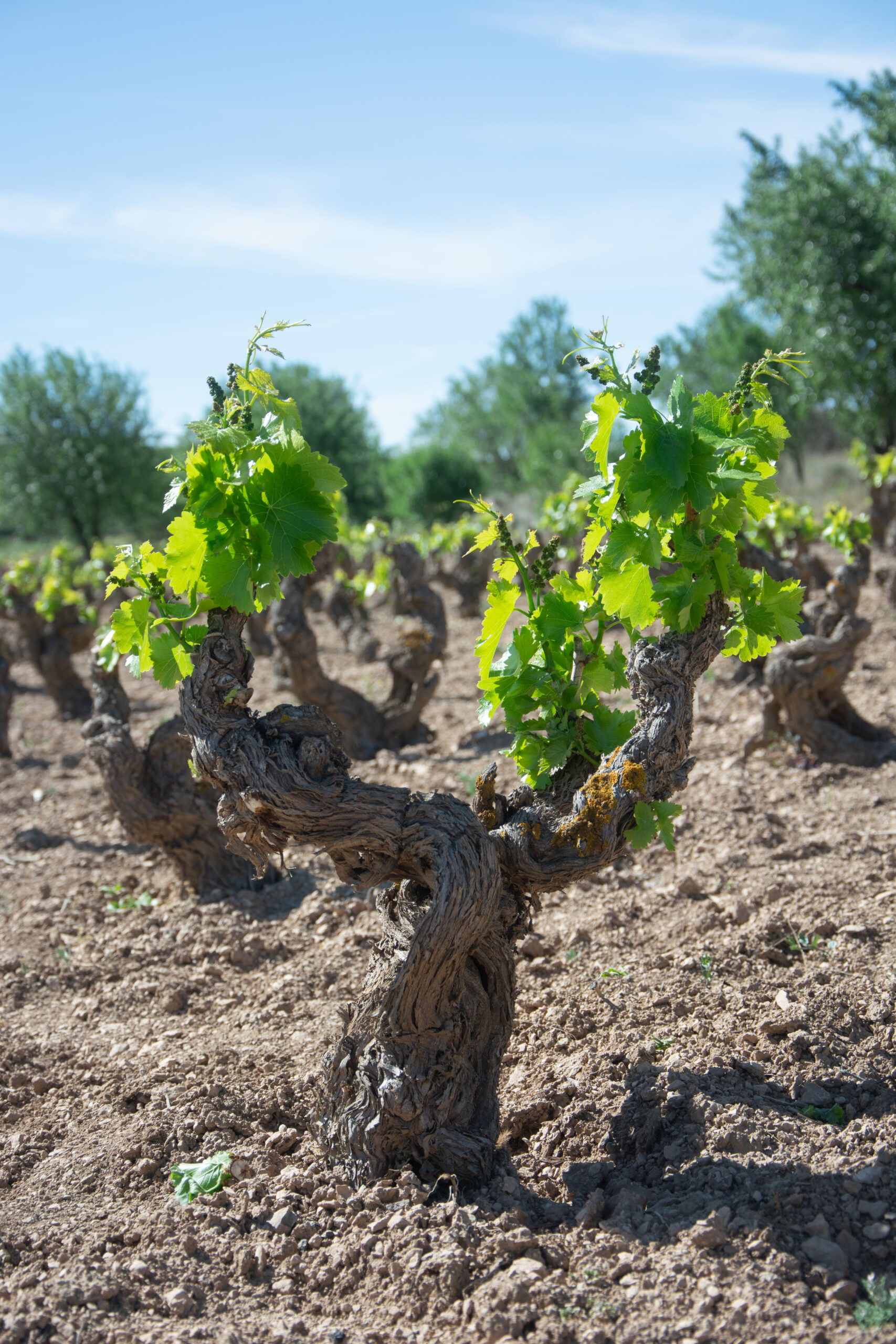
In the first meetings and visits to the vineyards and winery, we found a beautiful story that will be the guiding thread of the project: The vineyards planted in Castejón de Valdejasa respond to a tradition that was widespread in our country, that of serving for each house or 'fire' of the people, to produce their own wines for consumption during the year. However, this tradition, now forgotten in the village due to the death or aging of the owners of these vineyards, meant that the micro-plots of vineyards surrounding the village were left unattended and without a generational replacement to take care of them. In a way, they were 'orphaned of care'.
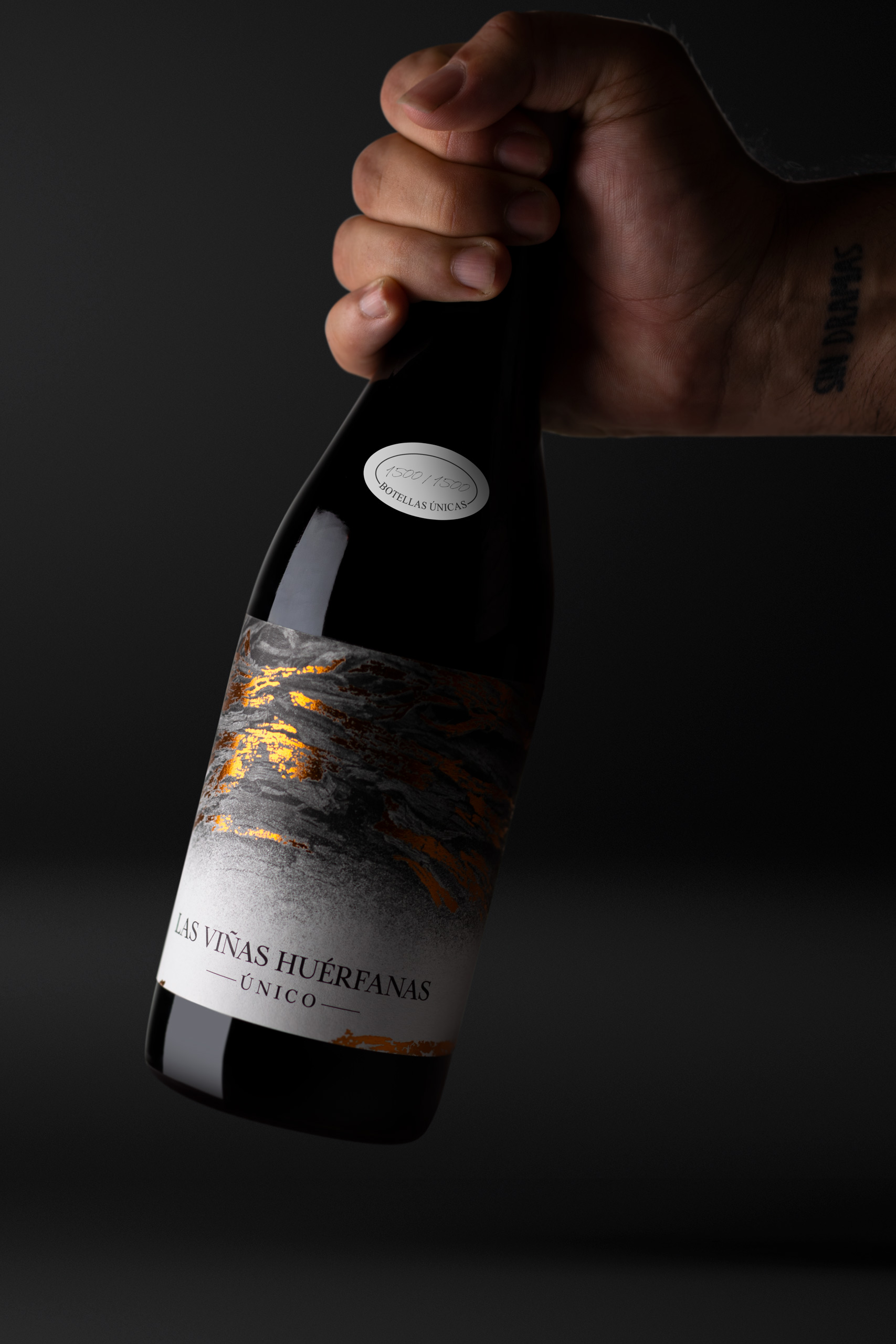
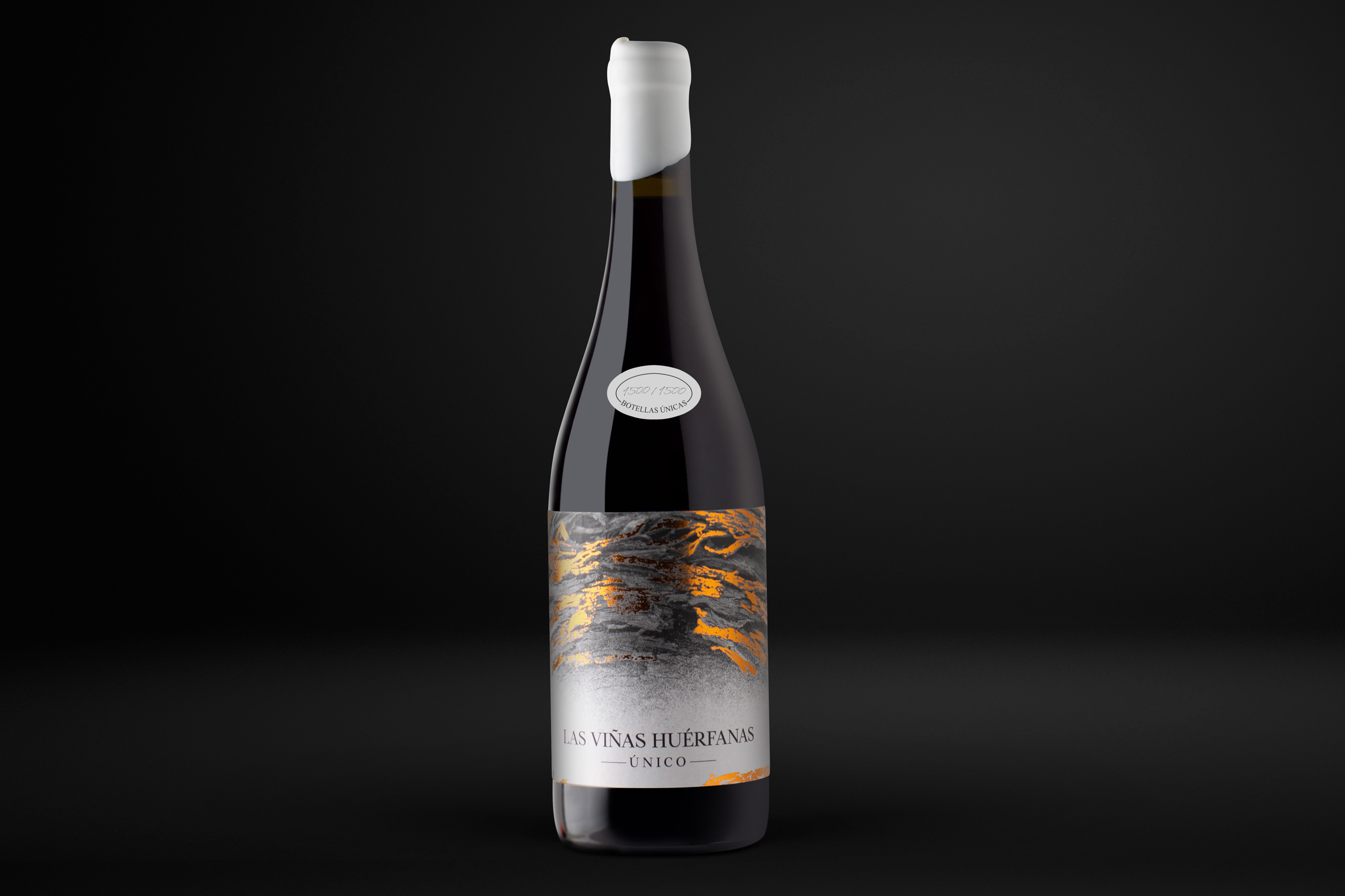
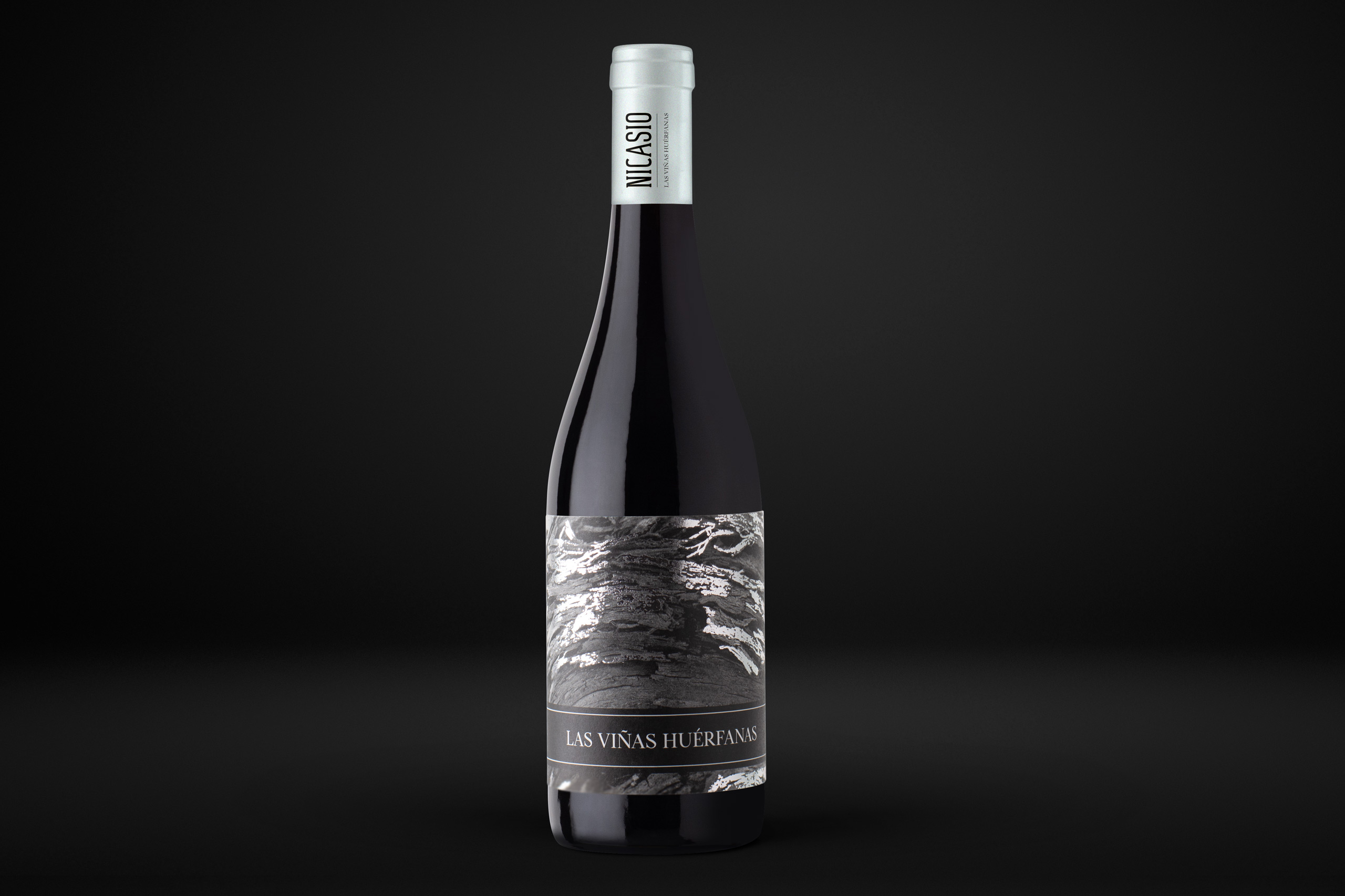
This is how we first decided on the concept and naming of the brand: ‘Las Viñas Huérfanas ‘, making clear reference to the adoption and care of these vineyards that until now had been completely neglected.
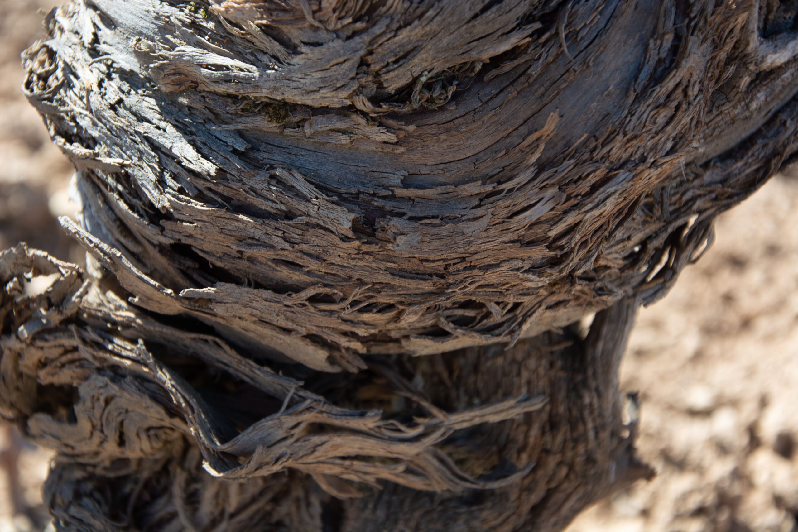
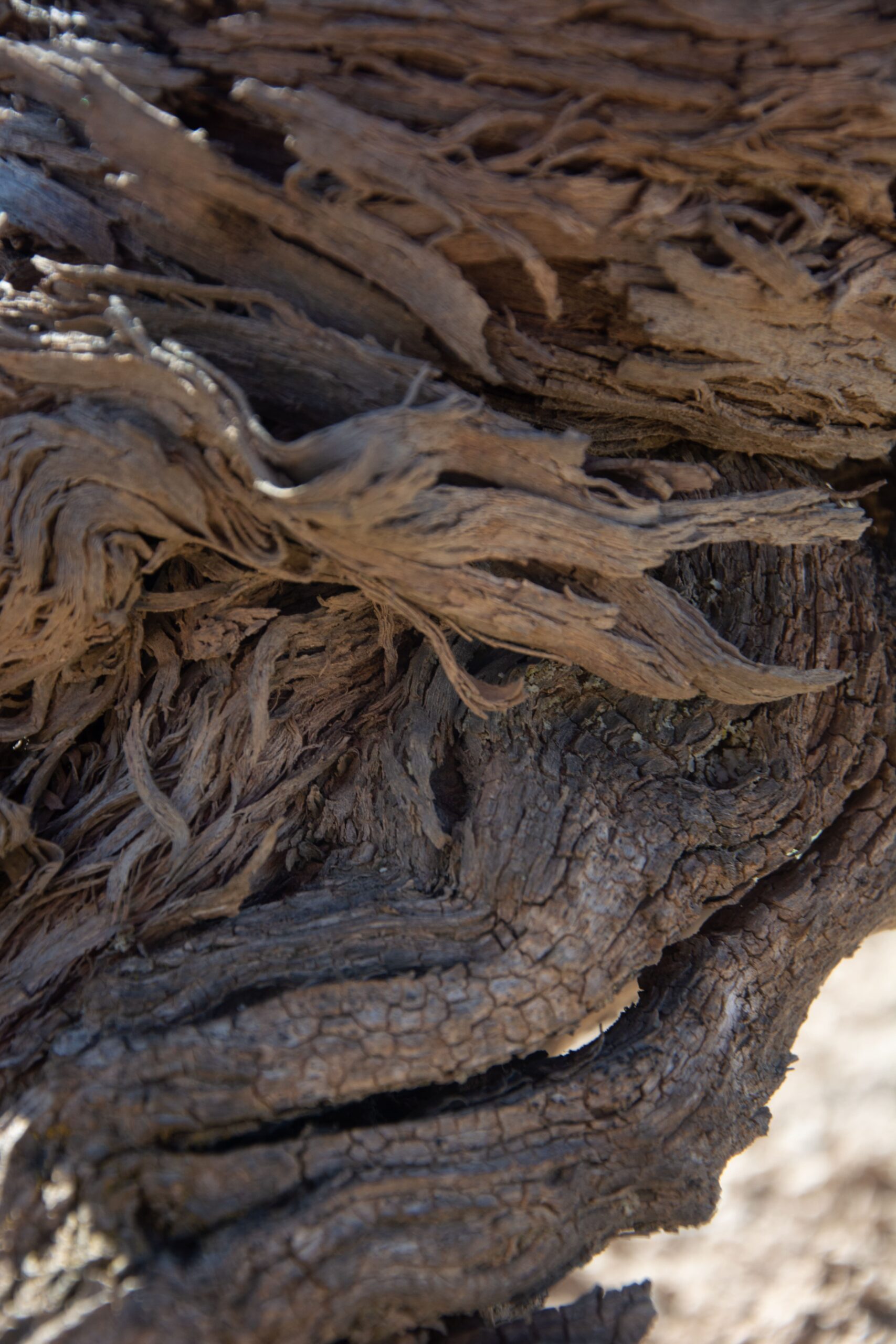
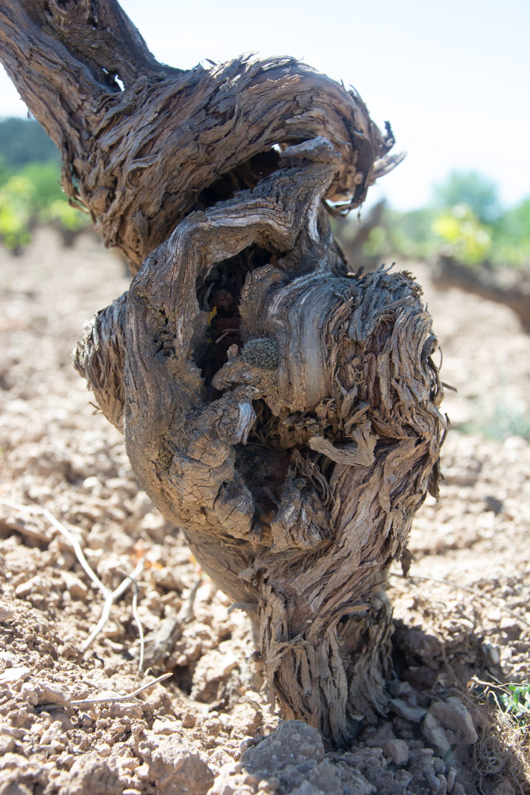
When we saw those vineyards, some of them pre-phylloxera, or met one of their caretakers, who said that the exact type of vines in certain areas was not known, we clearly saw what the image and the visual thread of all its labeling should be.
Antiquity, history and a Story-Telling that would make great wineries want it.
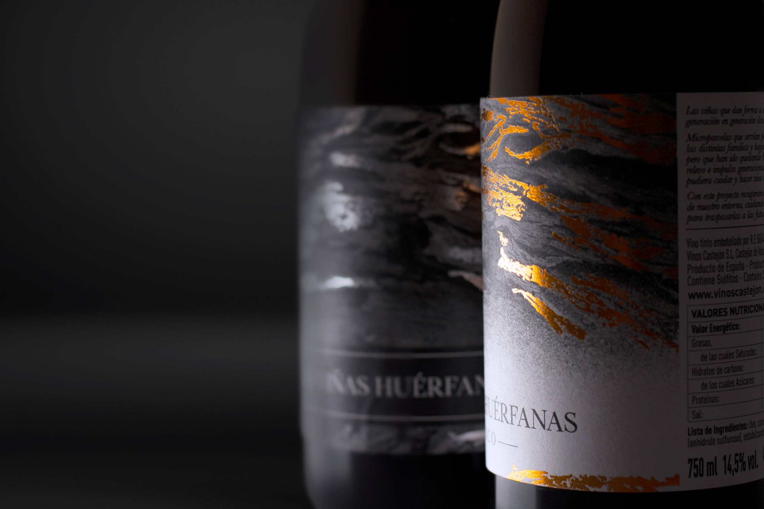
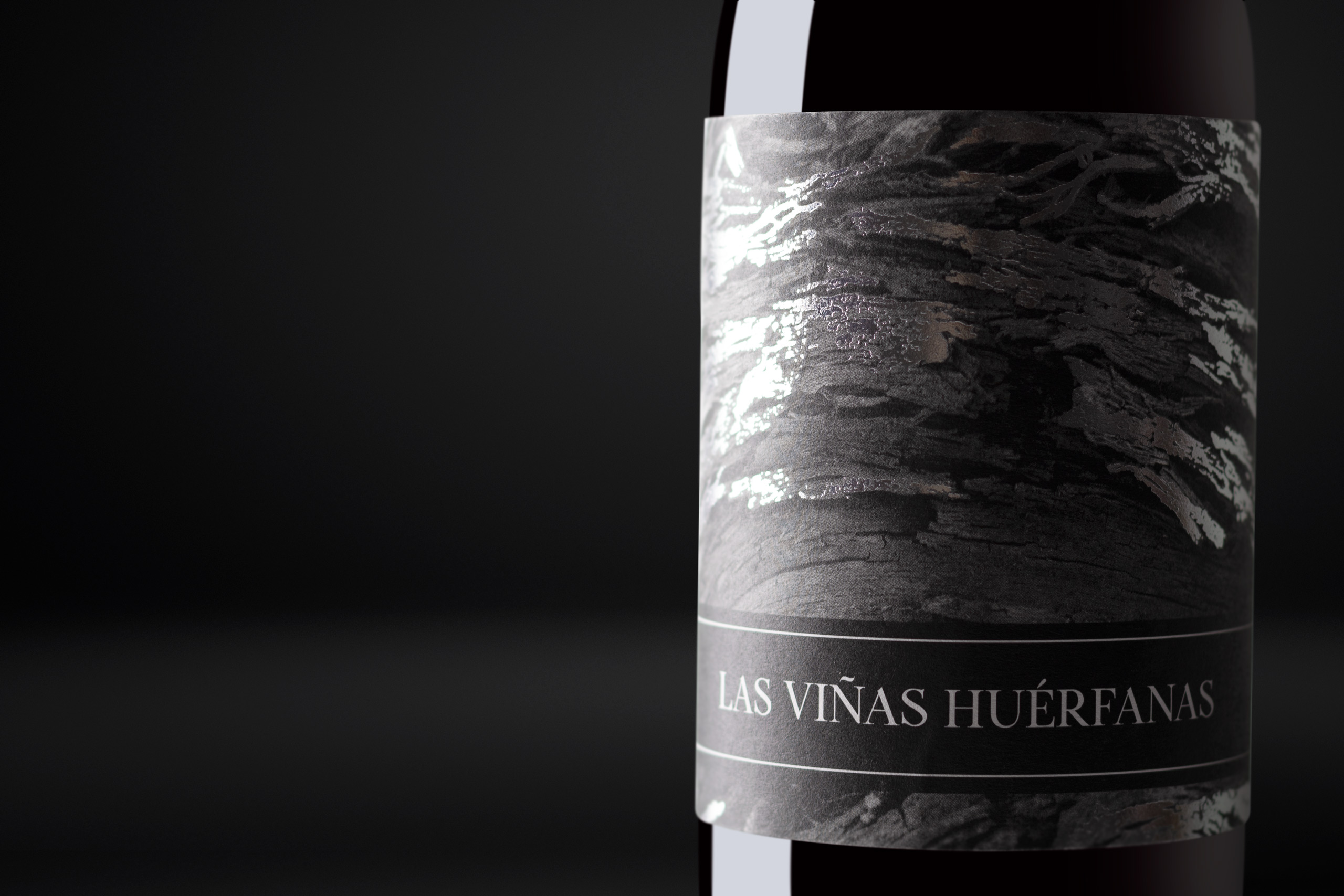
En este caso por supuesto, se trataba de un proyecto pequeño, pero con muchísimo trasfondo… Sólo hay que ver las cortezas de los viñedos para entender el patrimonio que suponen, y fue precisamente la inspiración para desarrollar el visual de sus etiquetas.
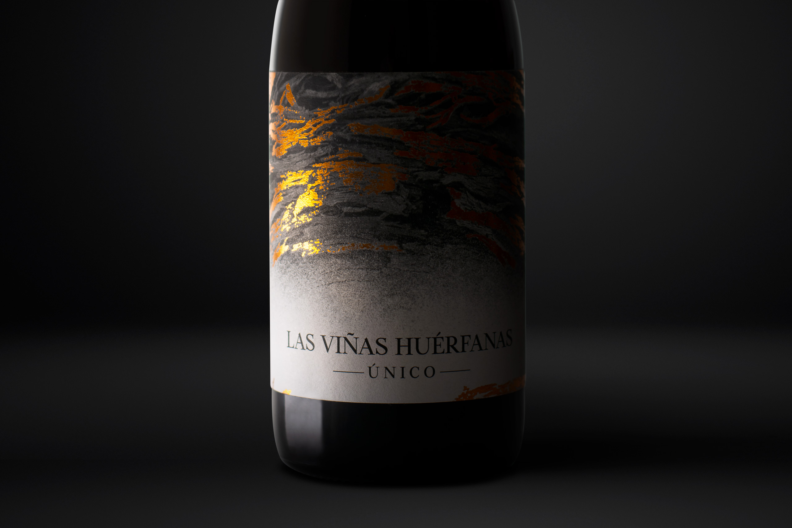
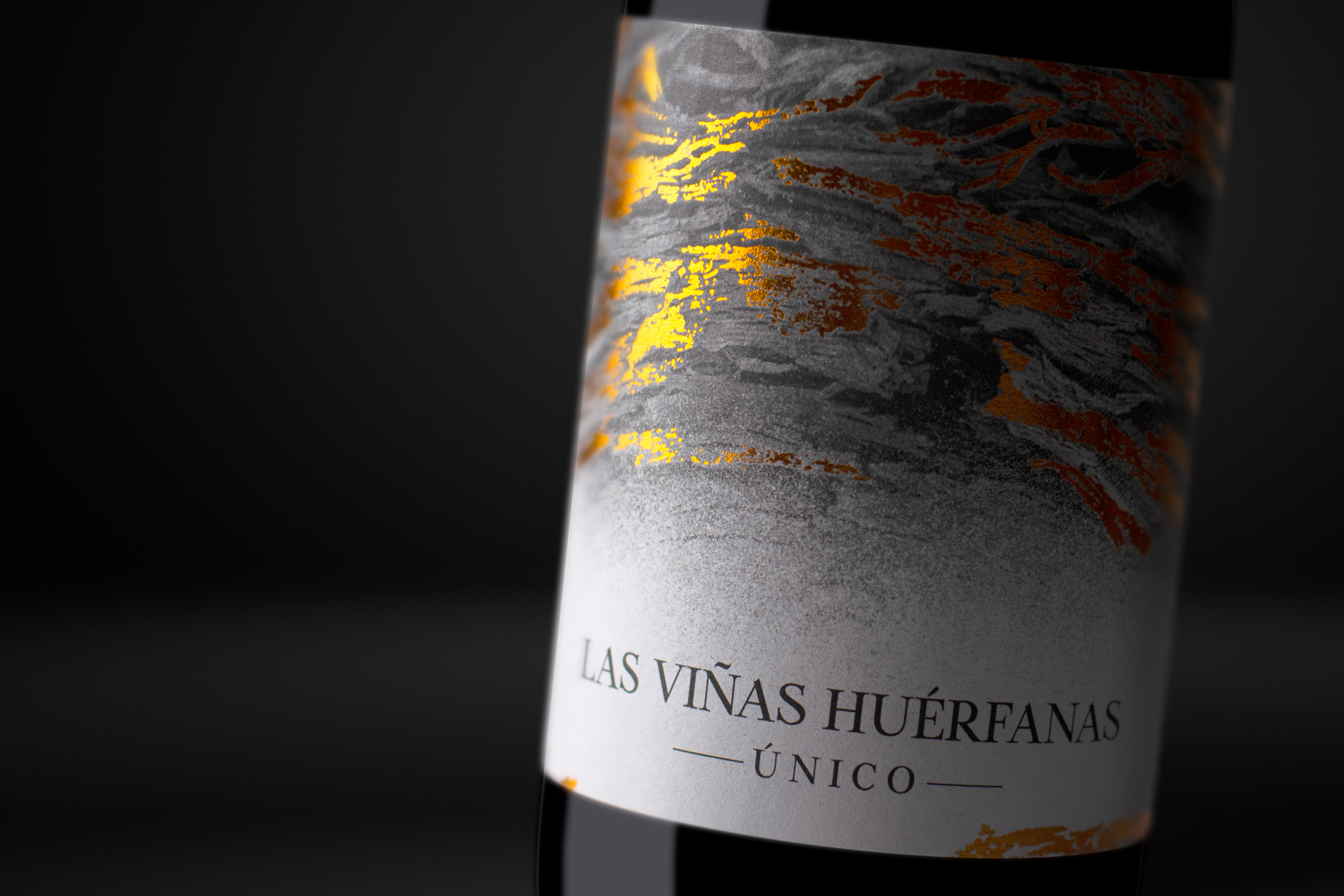
En las etiquetas quisimos representar, de un modo algo poético, la antigüedad de los viñedos, surcados de arrugas y cicatrices, fruto sin duda del tiempo, y añadir un Stamping plateado surgiendo, de algún modo, de las vetas de esa madera.
For its special edition, "Unique", we gave a twist to the concept to make it even more premium, adding a color change and a gradient, as if the mists of time wanted to eliminate the memory of a tradition recovered thanks to a courageous project that we are very proud to have been able to participate in.
At the brand level, we wanted to preserve the sobriety of the letters themselves so that the labeling of their wines, their main letter of presentation, would speak for itself.