Sant Martí de Maldà It is a small town in the province of Lleida that has a cooperative dedicated to the production of oils and EVOOs that is well known in the province.
They contacted us with the intention of reinterpreting their range of EVOOs from the oil mill, creating a new brand concept, separate from the other oils currently marketed by the cooperative.
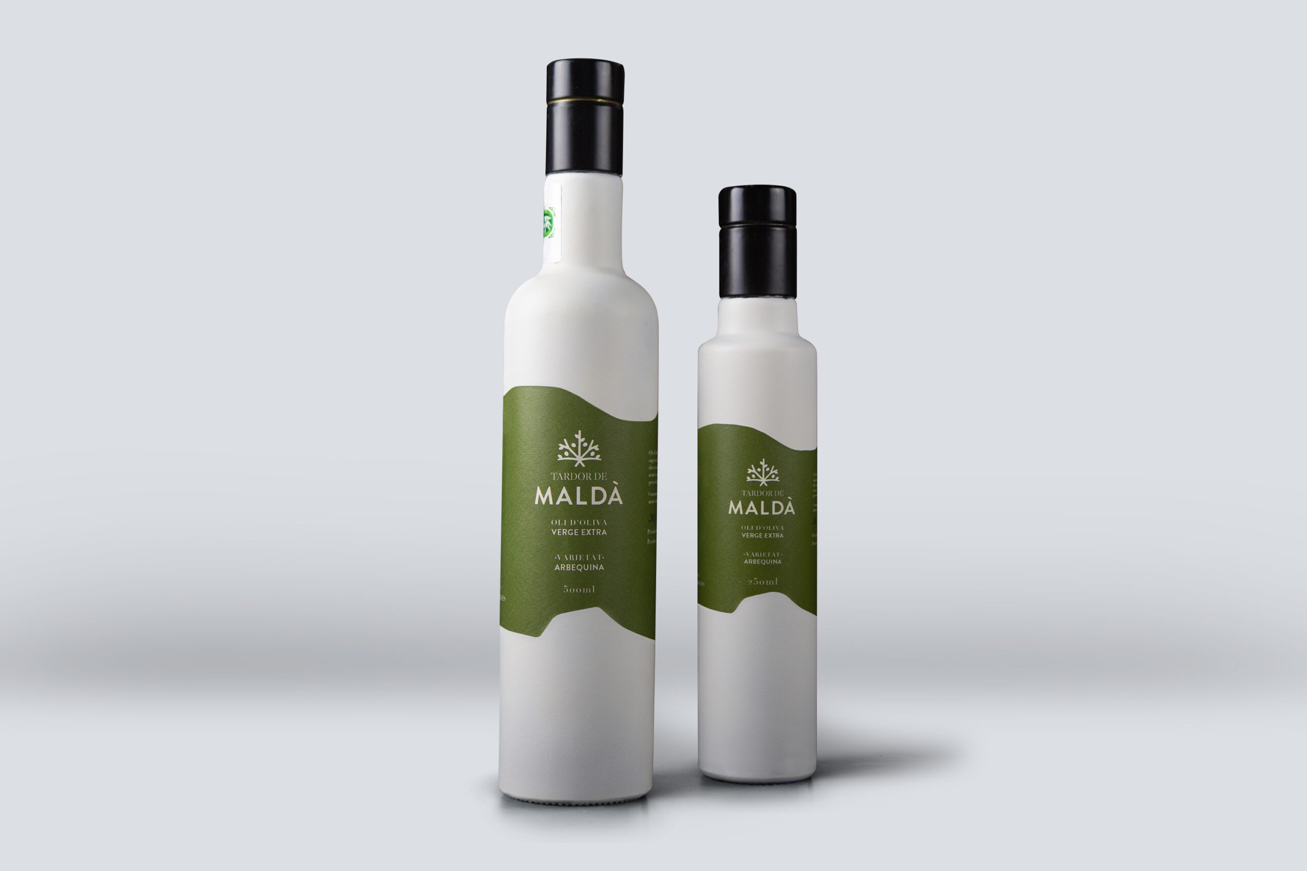
The first step, after conducting a competency study and product benchmarking, was the choice of two new containers, in 250 and 500 ml formats, discarding the 1.5 l container currently in use to give the oil itself a more refined and manageable profile. Although the oil was of high quality, its previous presentation did not set it apart, and the aim was to to provide you with precisely that: higher quality, cleanliness, and refinement., along with the price strategy analysis, which we managed to resolve precisely by choosing two new formats.
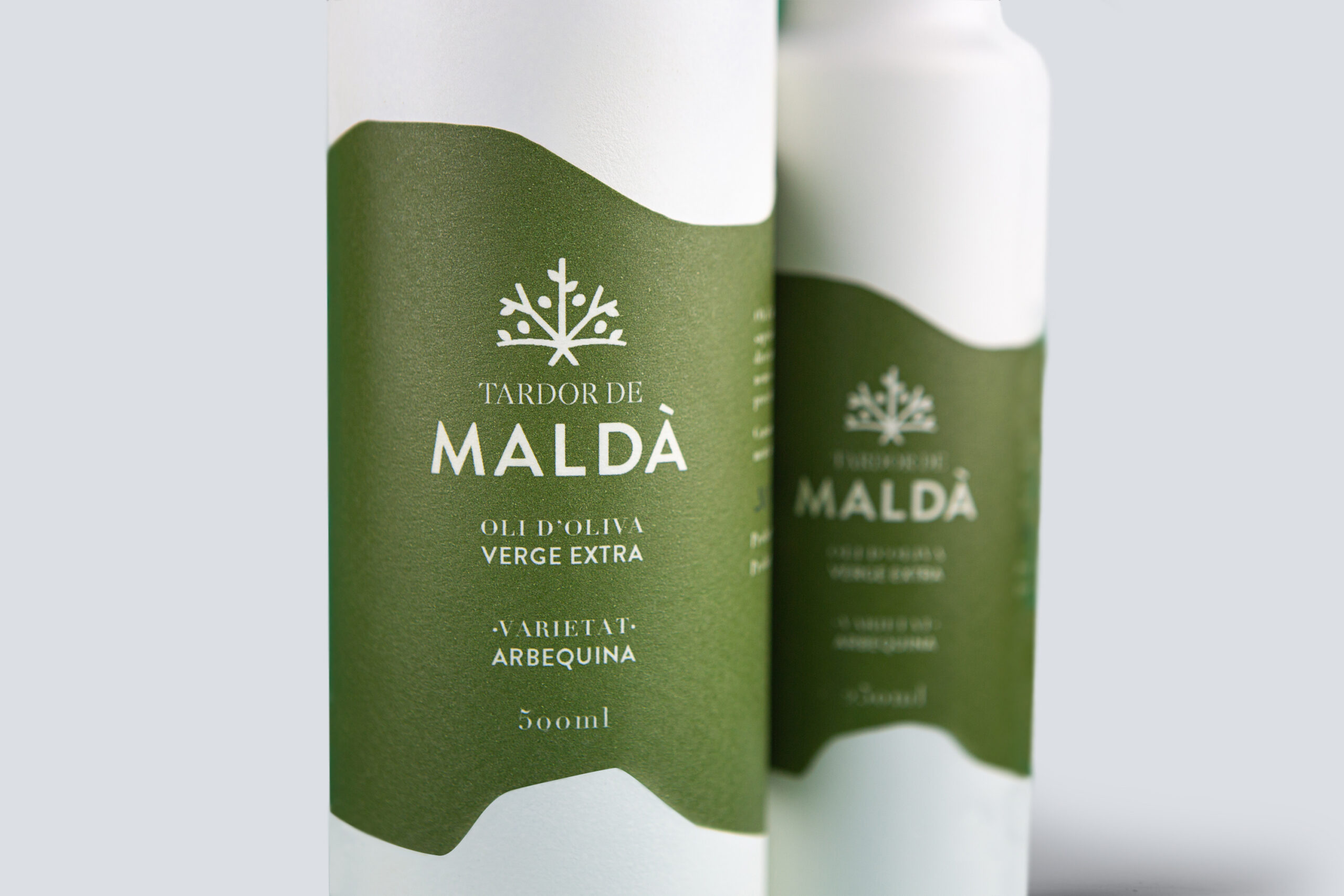
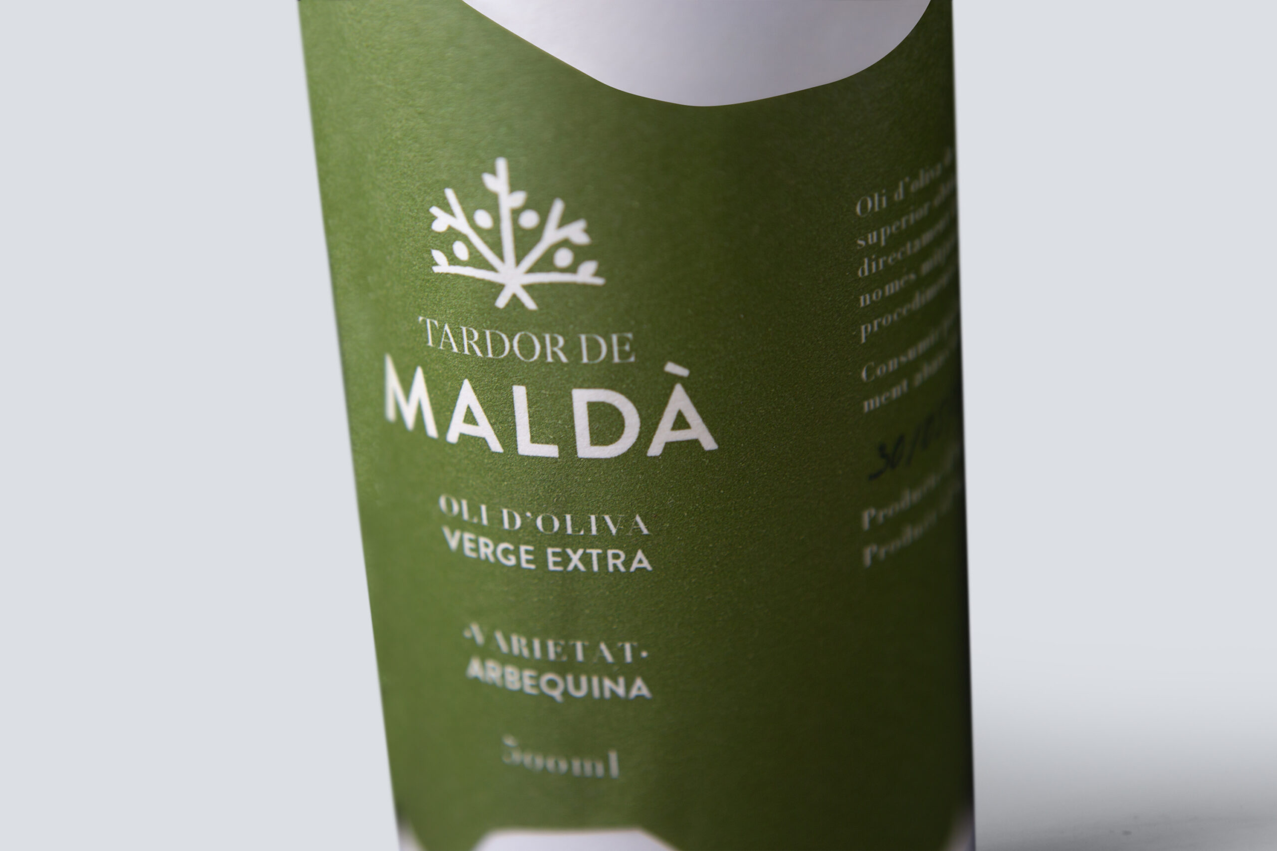
Next, we worked on the bottles, choosing an entirely white finish to create a greater contrast between the label, which we designed in green, and the white itself, which provided the clean look we were seeking, as well as that more gastronomic touch. that it was visible on the shelfand that it had the refinement that we worked with by combining sans serif and serif fonts from the label itself.
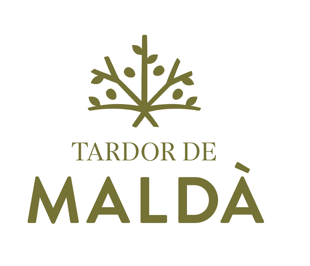
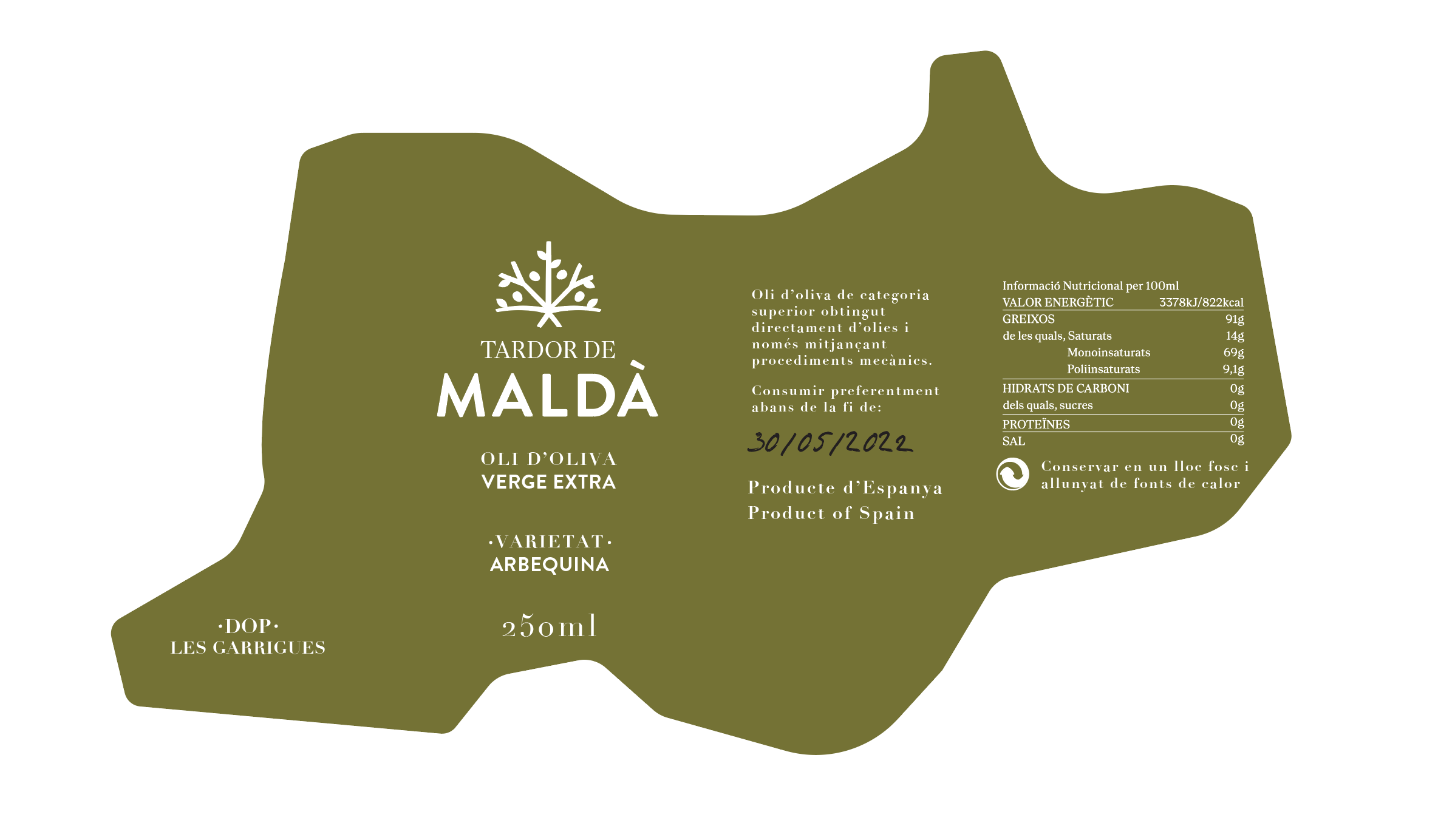
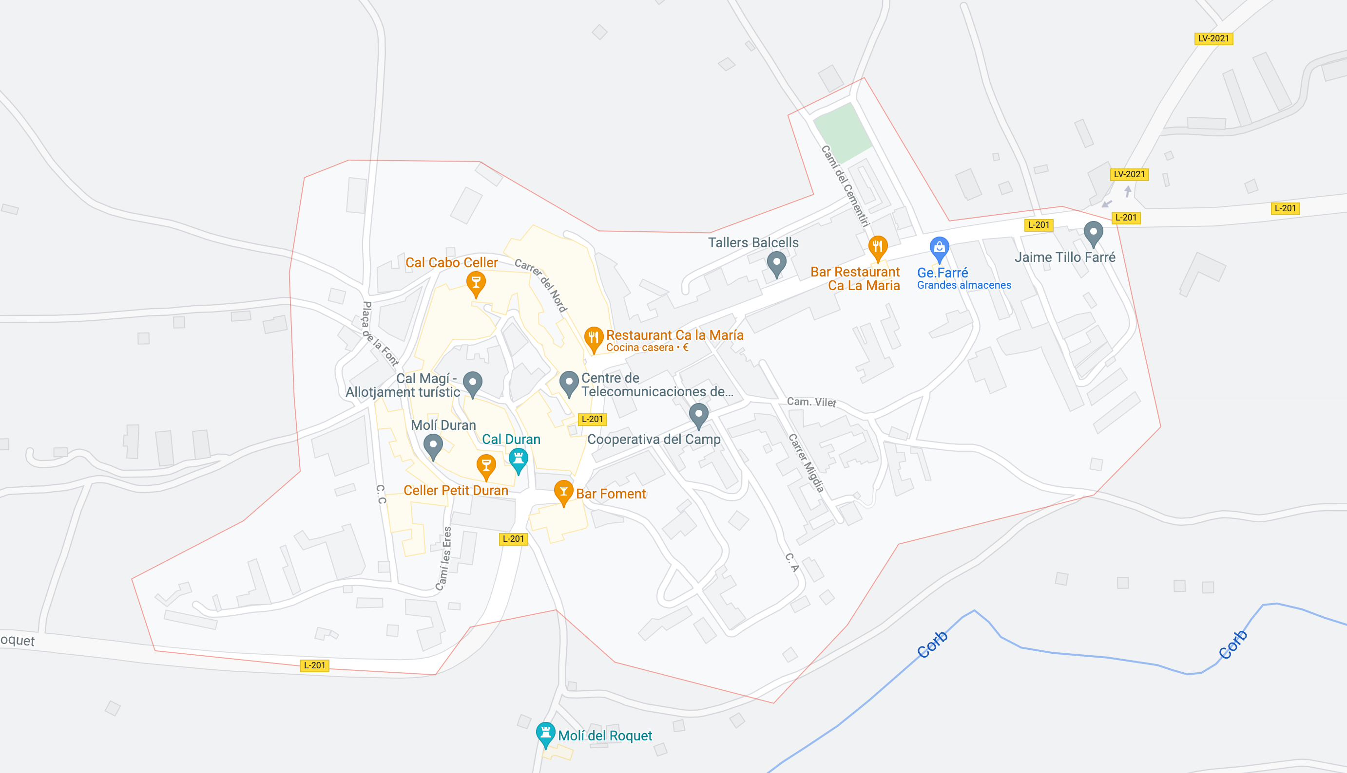
For the label, we traced a die cut with the outline of the town of Sant Martí de Maldà so that we could directly embed the map of the town on the bottle, and we created a logo representing, in a schematic way, one of the Arbequina olive trees in the area.
We finished the project with grease-proof paper so that the black capsule would not be damaged by oil, which was necessary in this case due to the product's own safety protection and seal.