One of the coolest things about working with wineries is that, when you tackle the rebranding of established wineries, there are few that do not exceed (or are about to reach) a hundred years of history.
This forces us to think about durability parameters and timeless visual design, so that this winery does not have to go through another brand creation process for at least the next 20 years, and so that it can continue to be easily and directly recognized throughout that time.
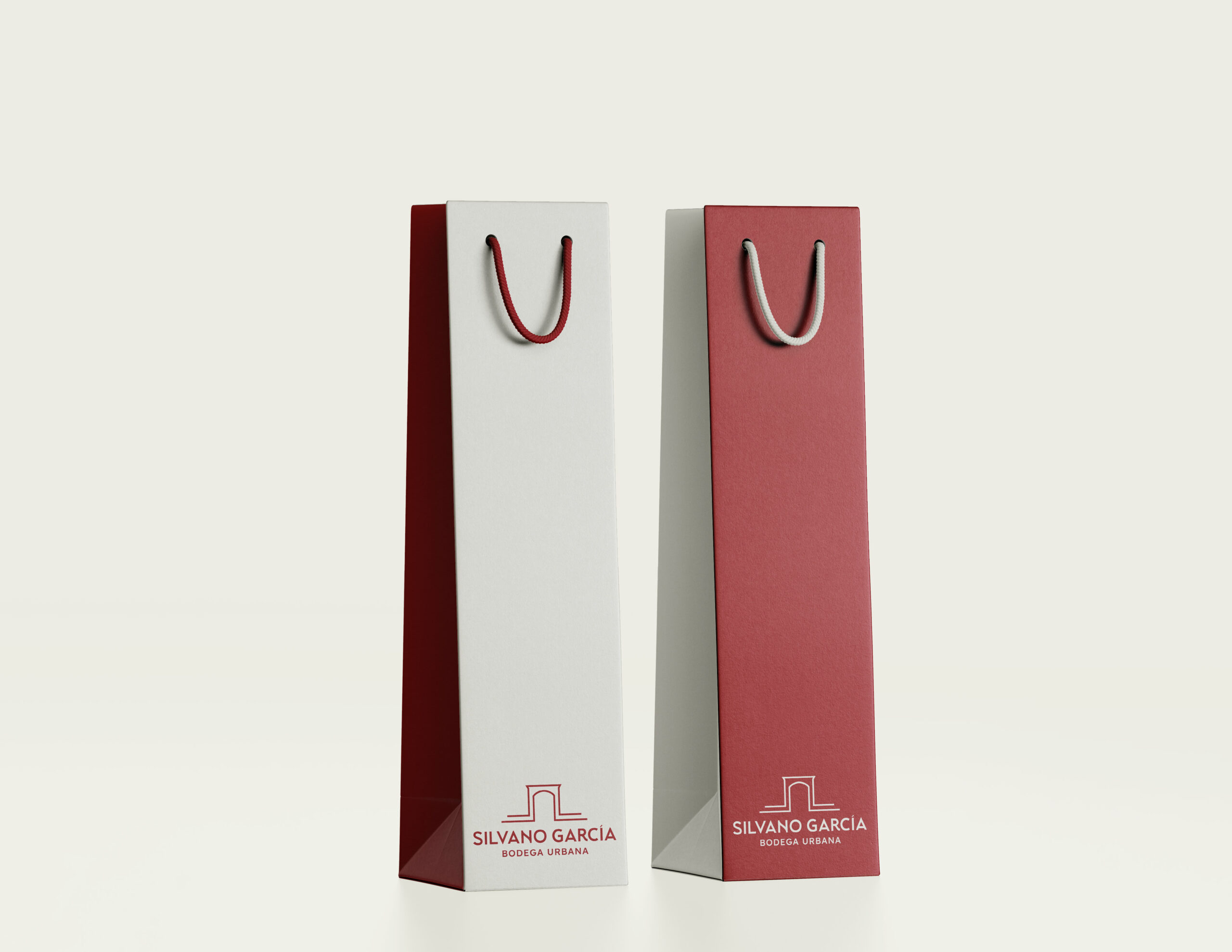
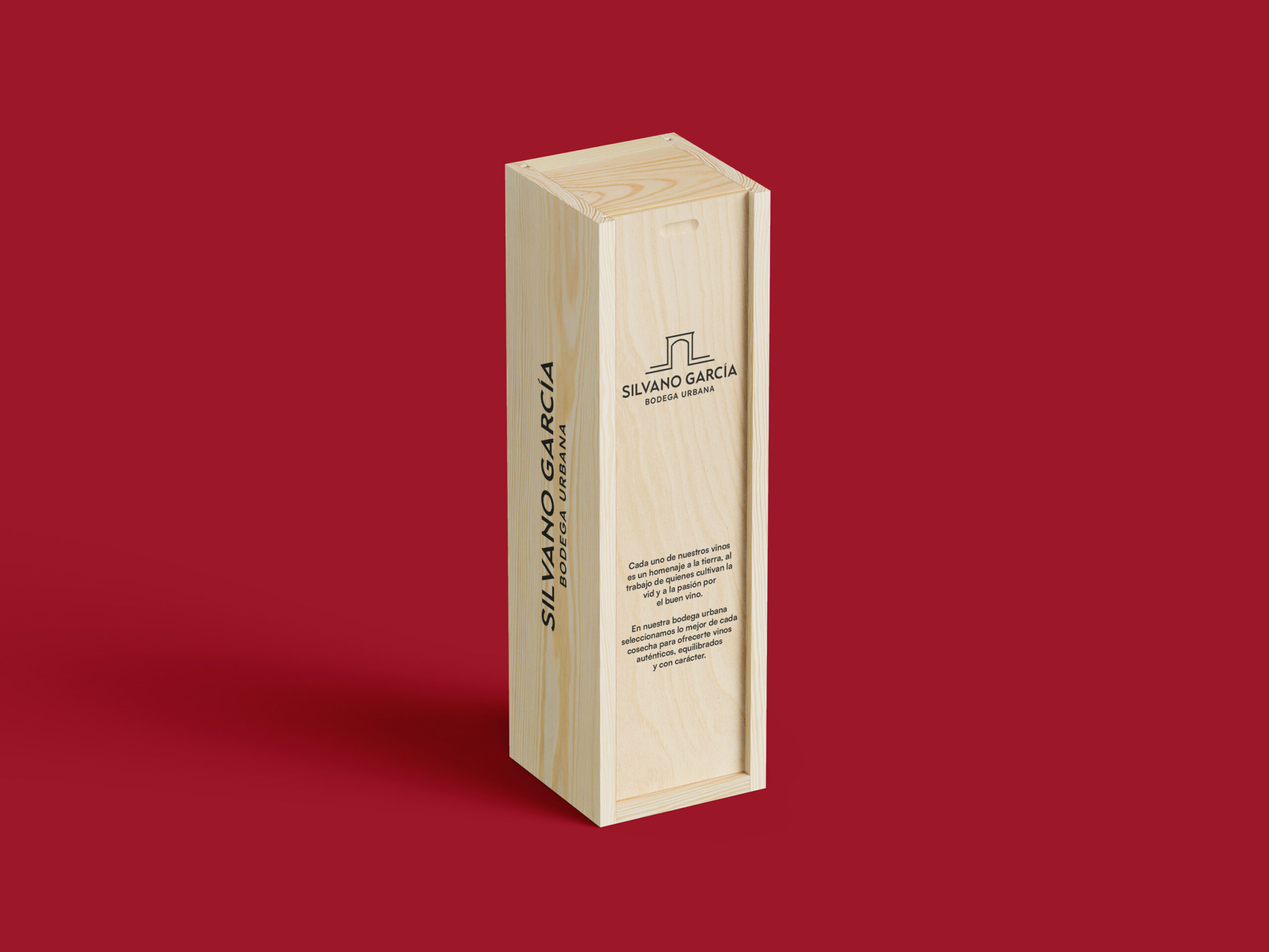
That was the challenge we took on with the Jumilla winery Silvano García. Its last rebranding was more than two decades ago, so we wanted to come up with a timeless, simple, and recognizable proposal that went beyond its logo and allowed it to position itself in the market based on the honesty of its own message.
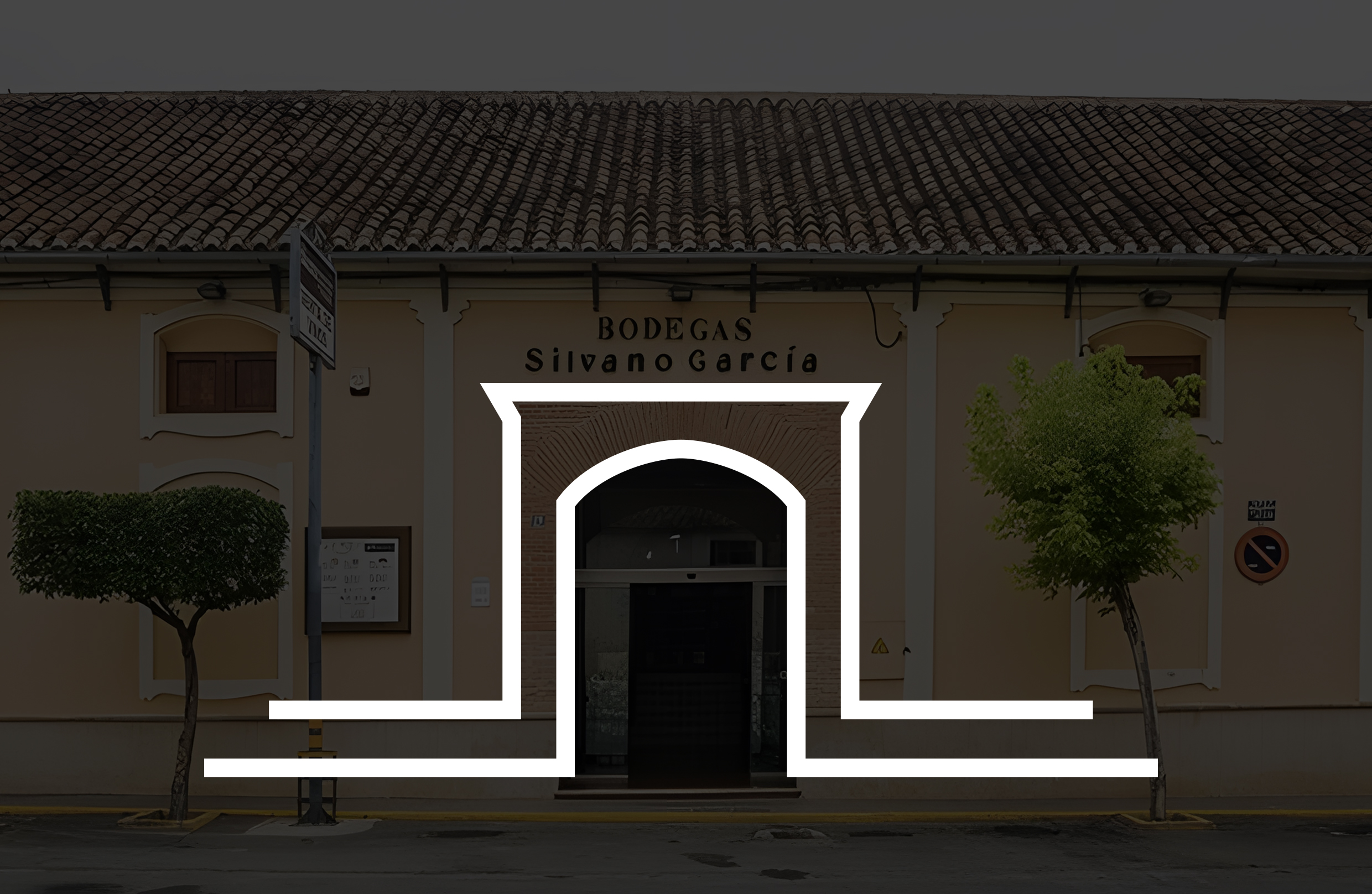
To achieve this, we looked for references in the winery itself, located in the heart of Jumilla, and turned its iconic and easily recognizable entrance into the isotype of the new image. Few things are more horizontal in a brand image than presenting an open door as part of its image, like an invitation to discover a winery that has proximity as one of the pillars of its identity.
The color palette came from the reddish tones of their old concrete tanks from the 1950s, a warm environment that we also wanted to convey in the photo shoot we did for them, which fit perfectly with the message we wanted to convey: transforming what could be perceived as a weakness (not having their own vineyards) into their main strength; asserting themselves as what they really are, an urban winery in the heart of Jumilla. A way of understanding wine production from a human and honest perspective, like the brand we created for them.
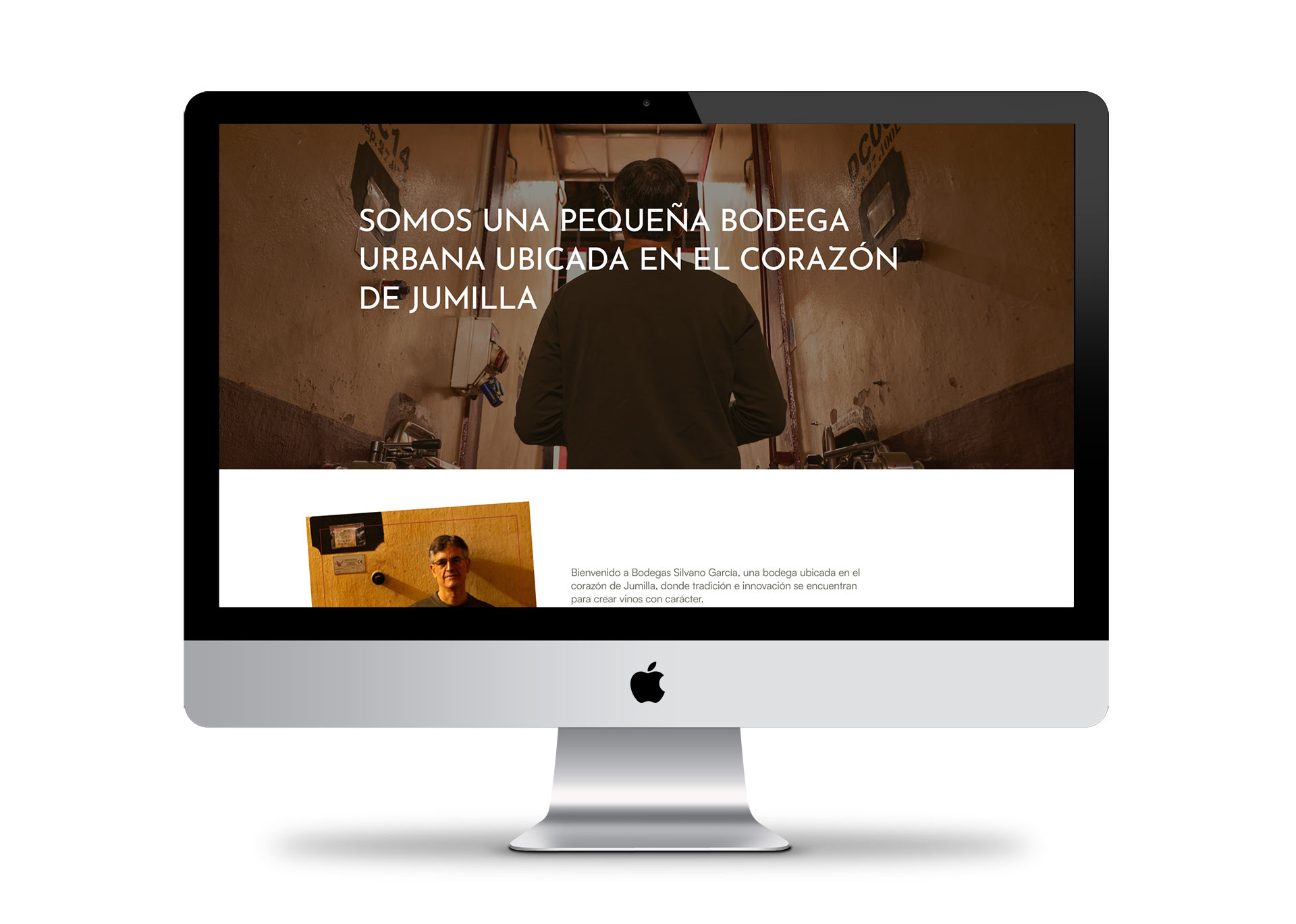
In addition to the entire rebranding process, we also redesigned their website, photo shoot, and online store.