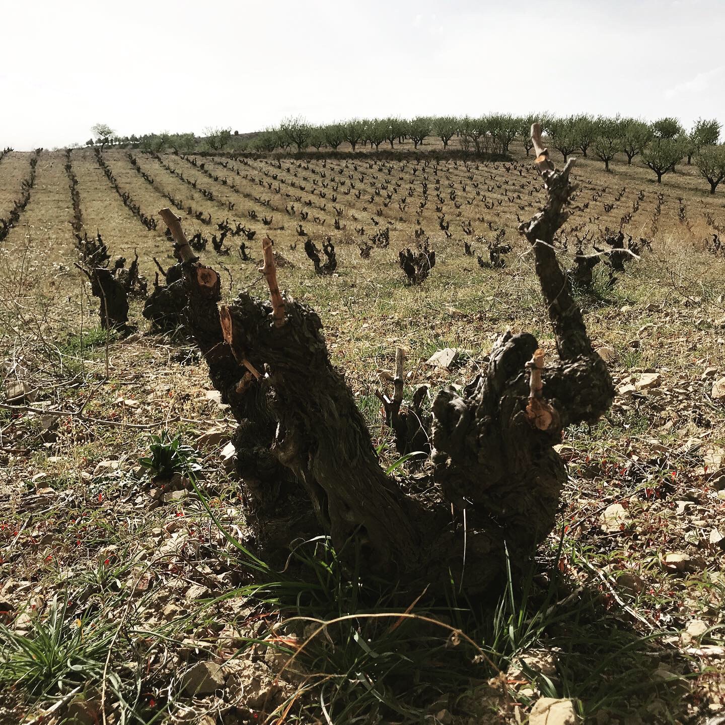
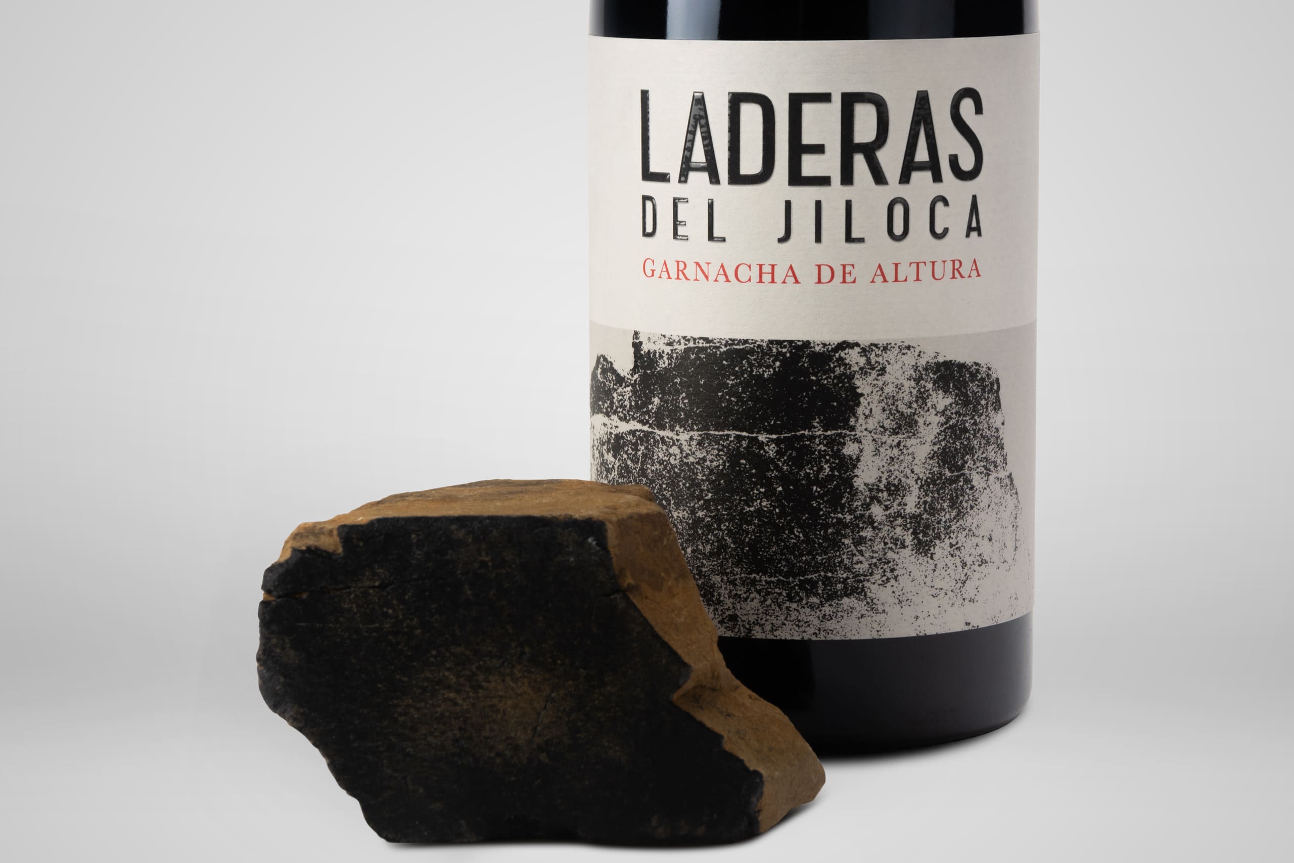
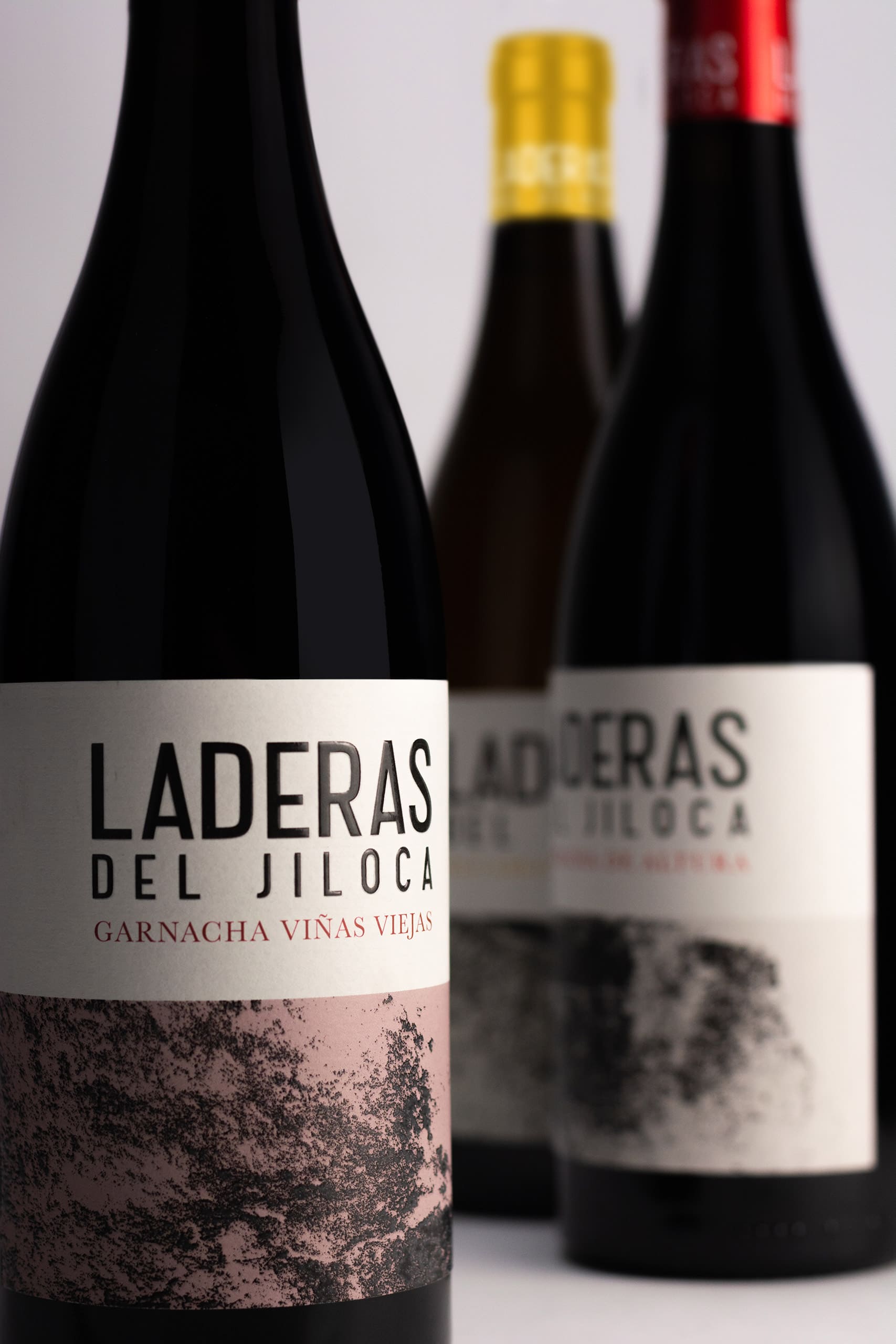
The project of Laderas del Jiloca It was a labeling design project for Bodegas Daroca in order to dress up his new family of wines.
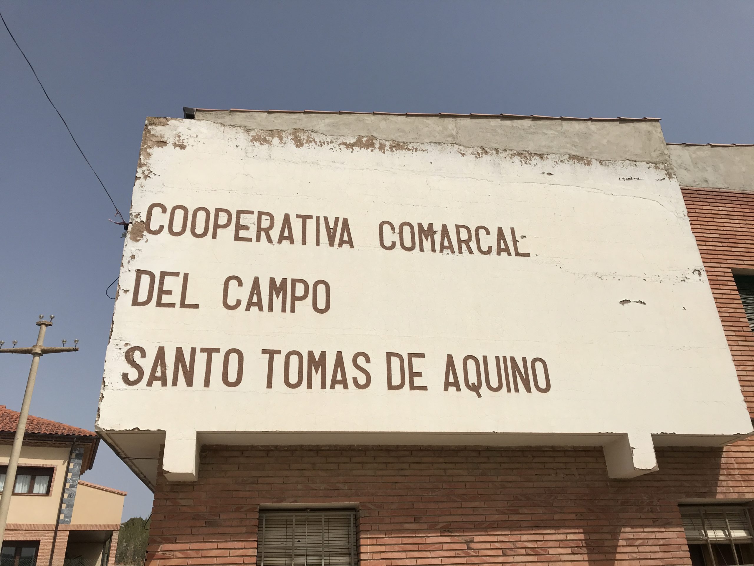
Bodegas Daroca is a cooperative project in the town of Daroca (Zaragoza) with more than 50 years of history, working with native grape varieties from the area.
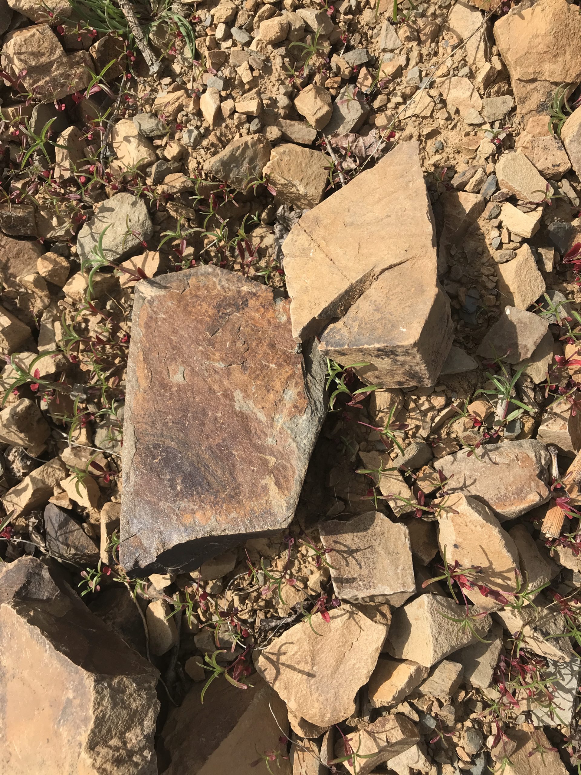
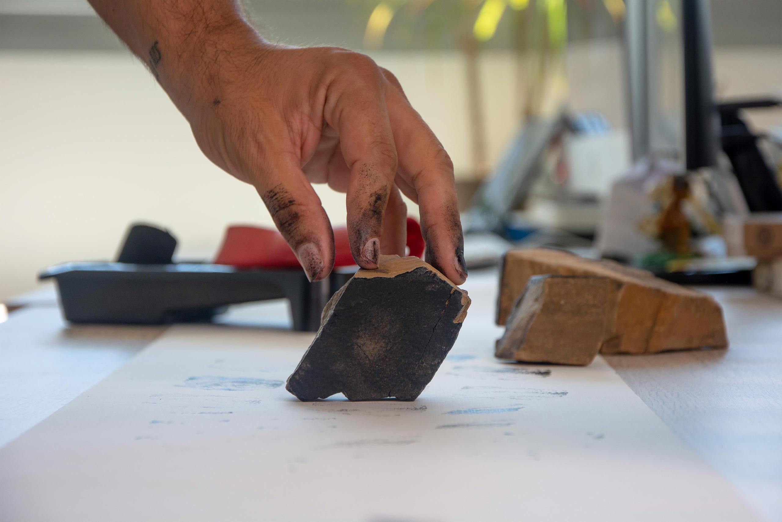
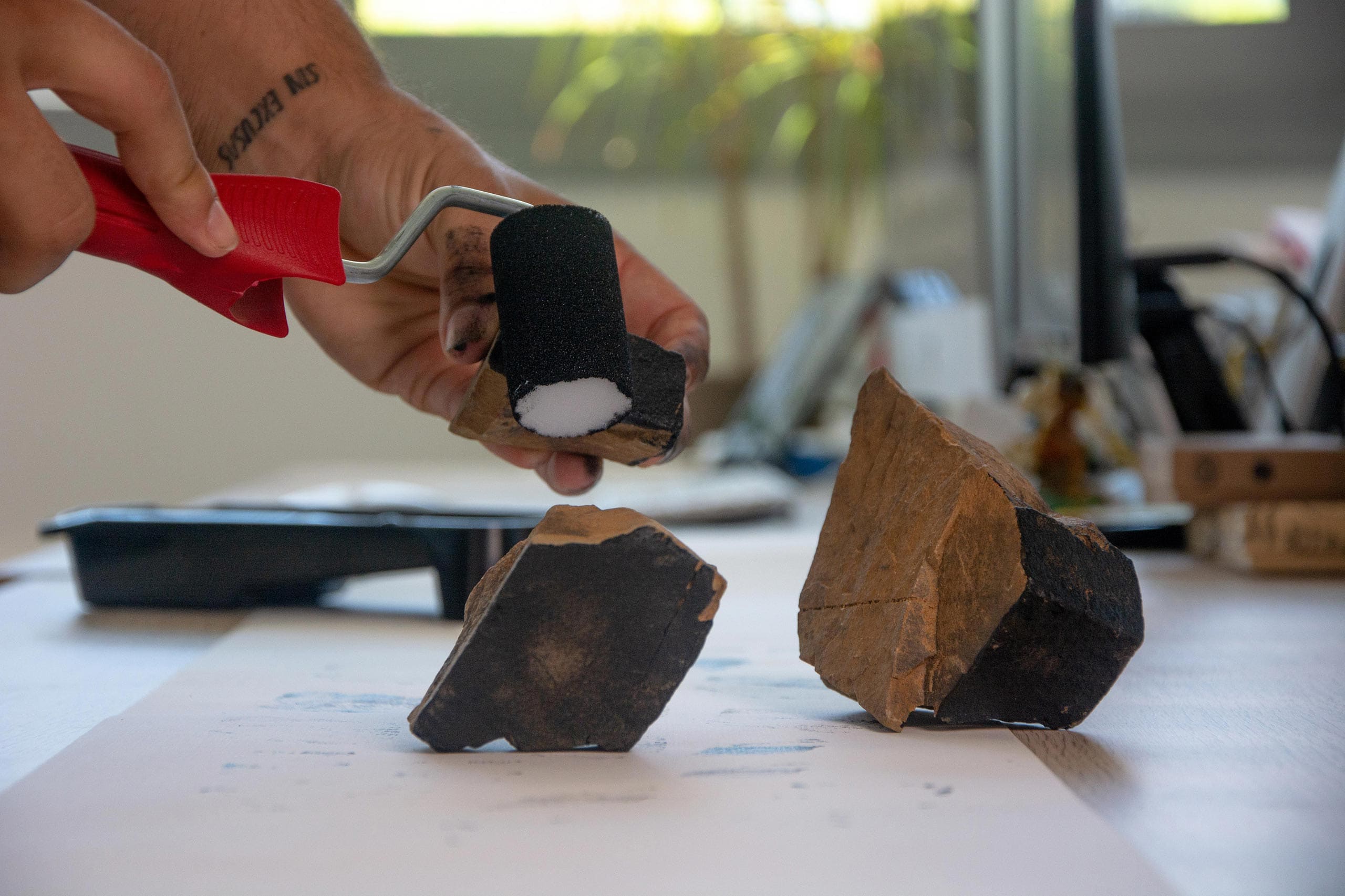
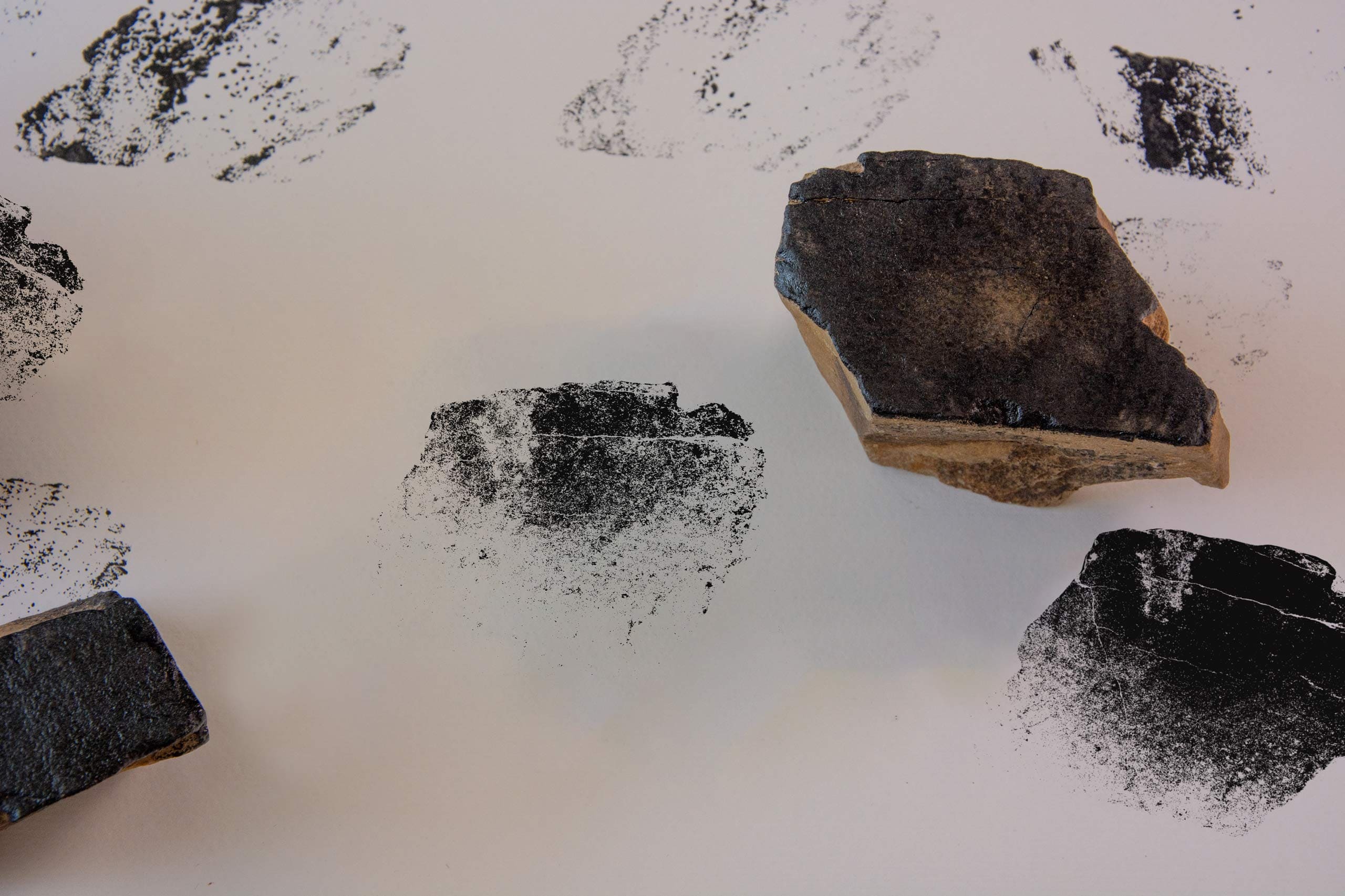
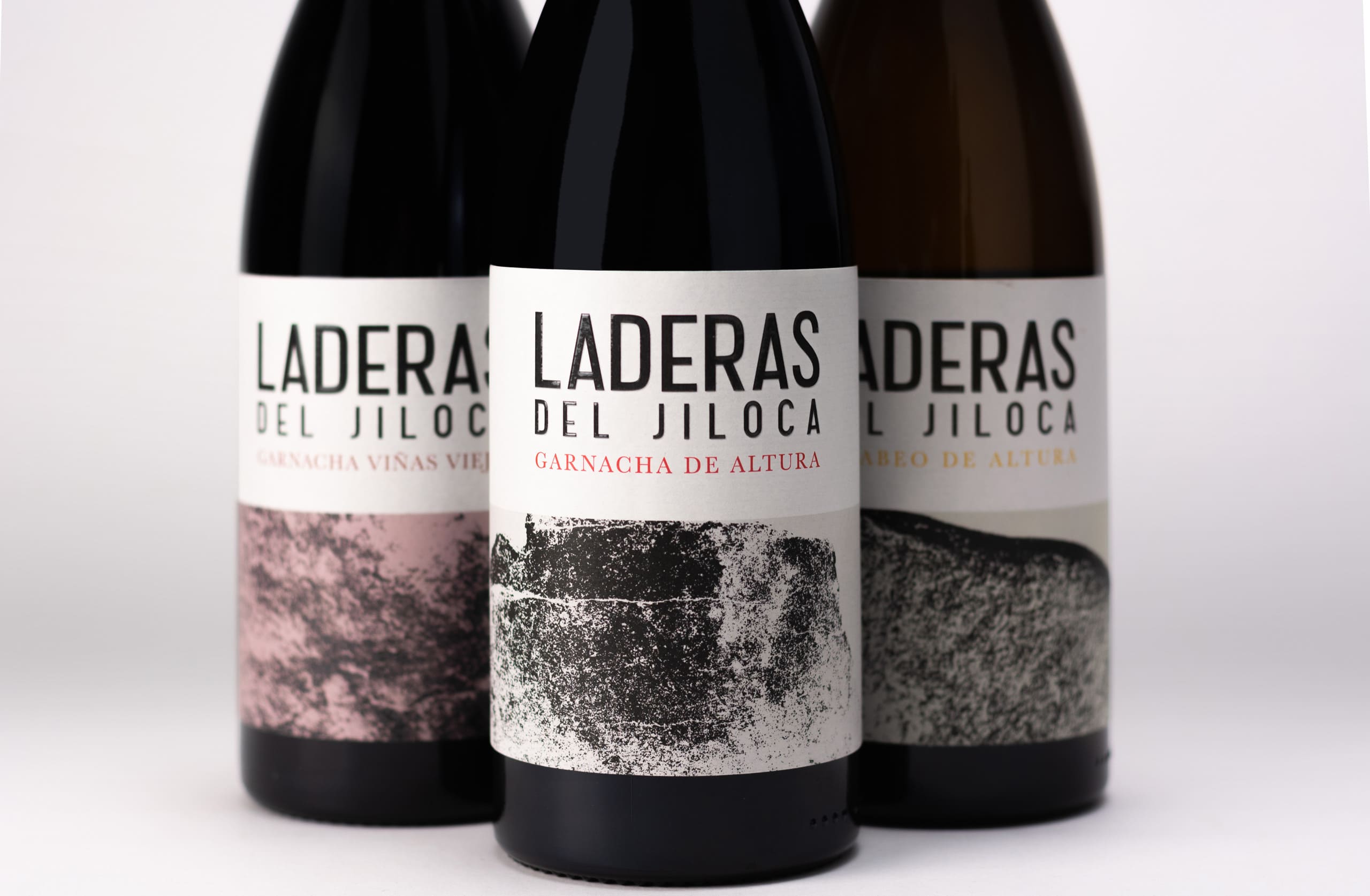
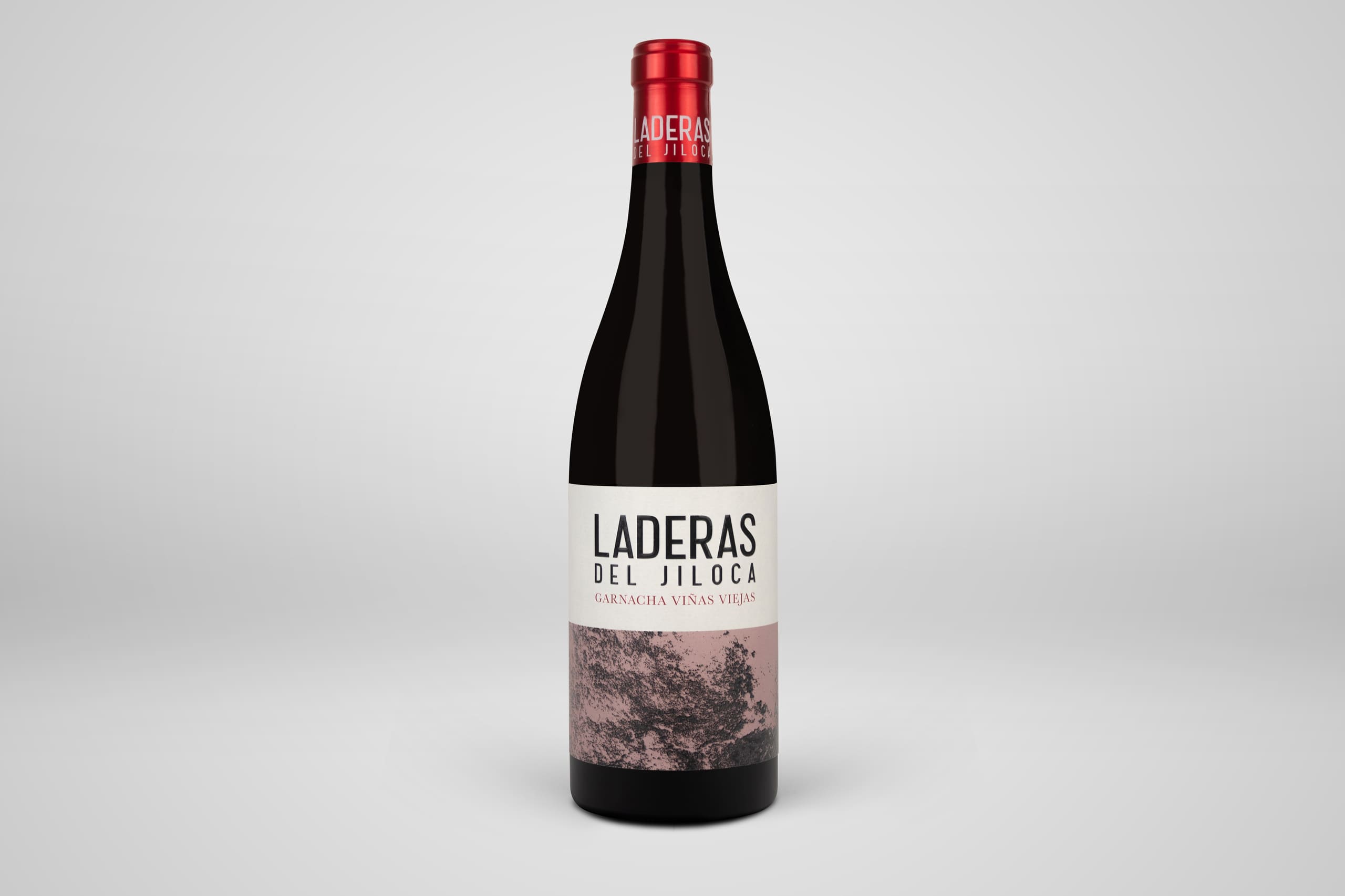
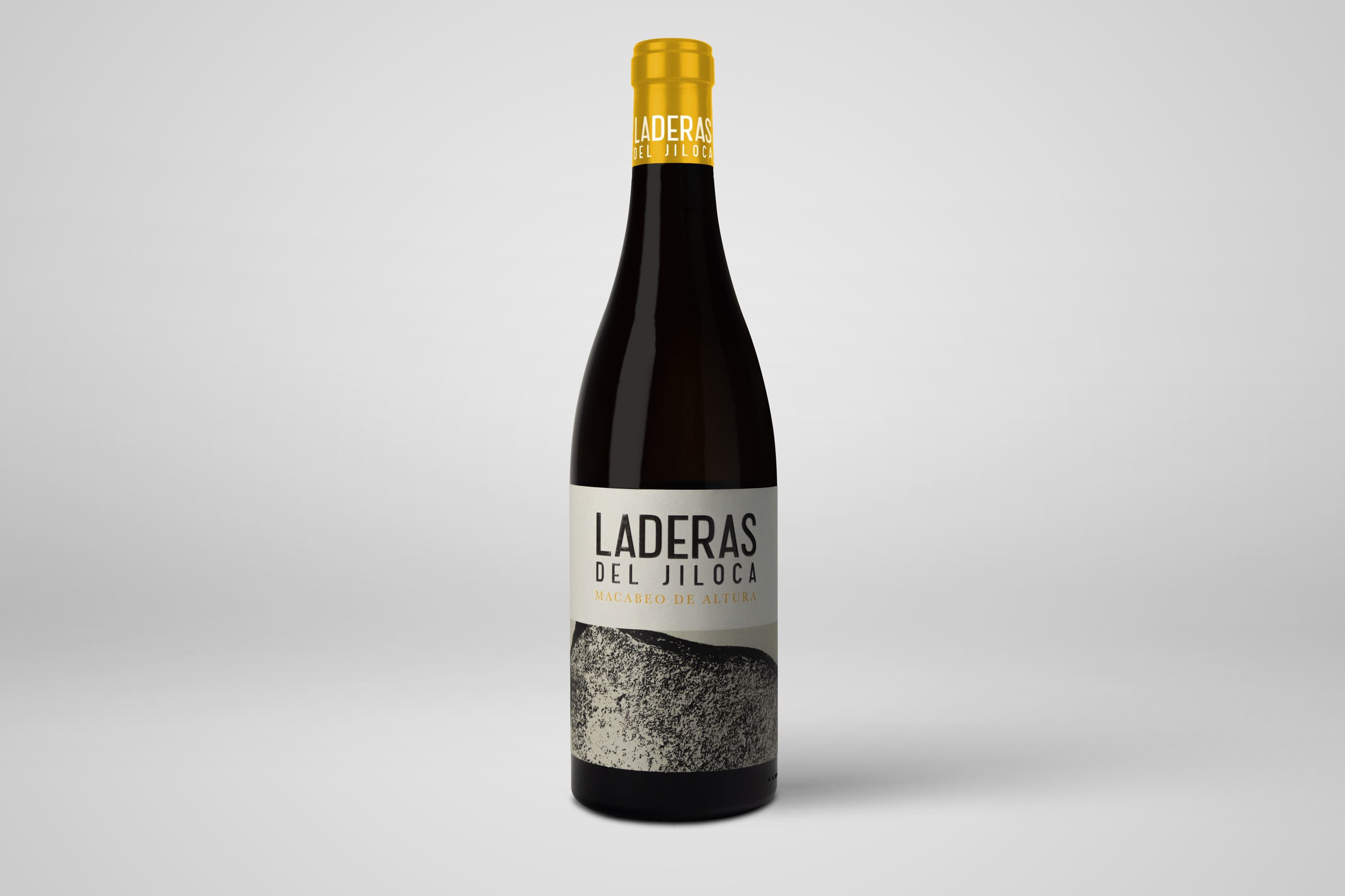
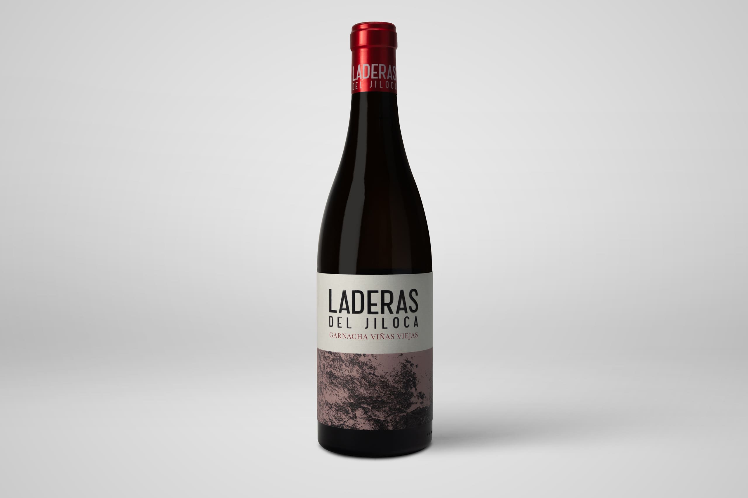
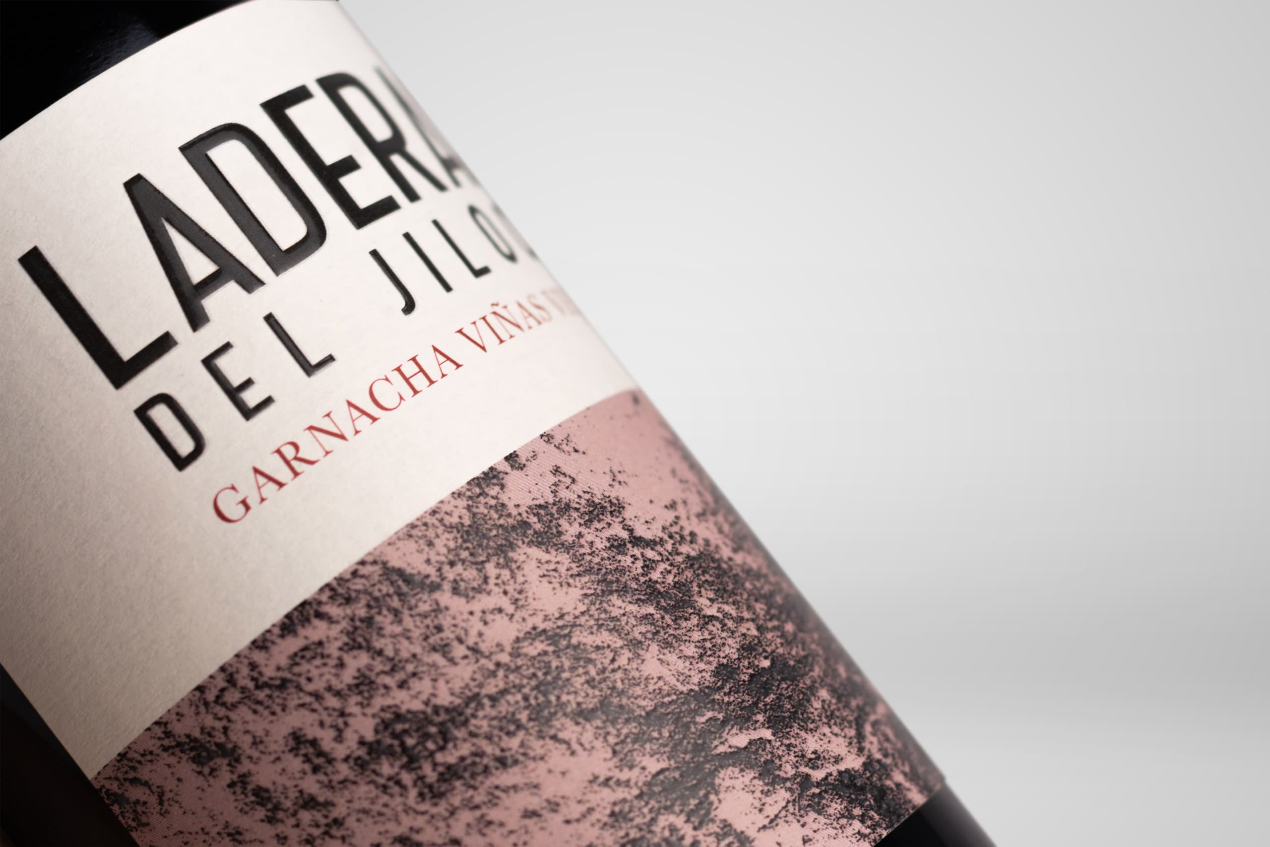
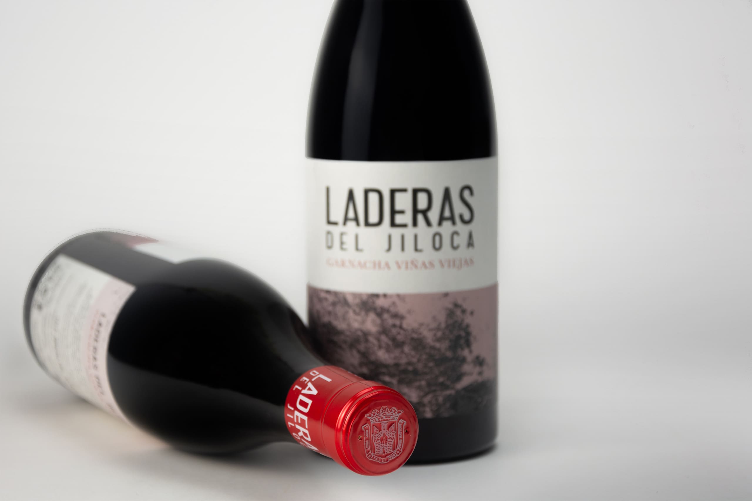
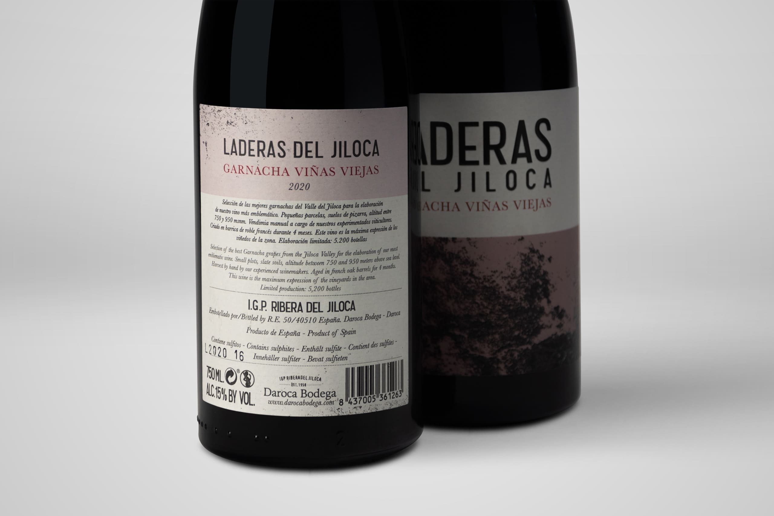
The Laderas del Jiloca project had a clear starting point on the ground, for this, we drew inspiration from the stones found in each of the areas of the vineyards where the grapes that shape their first three wines grow. In the process of creating the label, we collected several of these stones, slate pebbles from the hillsides, which we then used as "stamps," inking the flattest sides of each stone and trying to stamp them on paper of a certain thickness that would allow for a "clean" impression. After several tests, we managed to generate several designs that we used to make the labels.
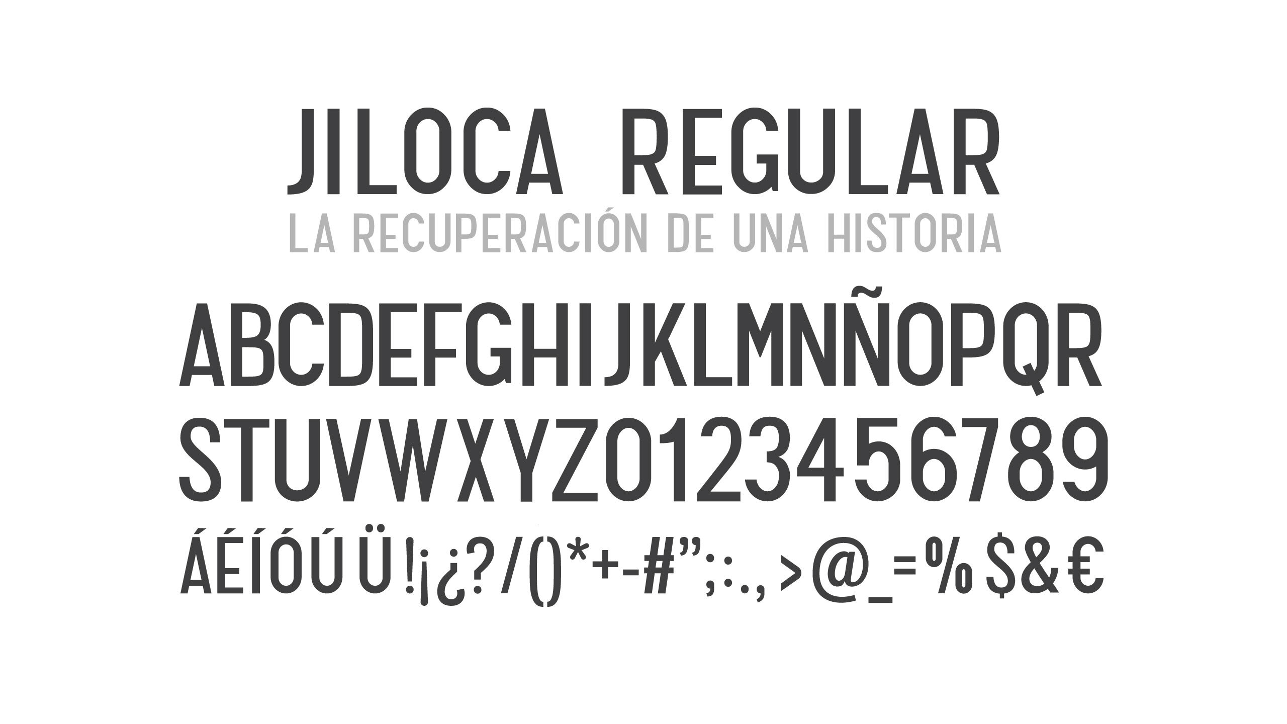
We complement the work of the labels by creating an ex-process typography for the label in order to unite history and territory. Inspired by the cooperative's own sans serif typeface, we designed the "JILOCA" typeface, which was added to other projects carried out for the winery.
The result is a completely cross-disciplinary project, initiated through field research and design, as well as graphic experimentation.