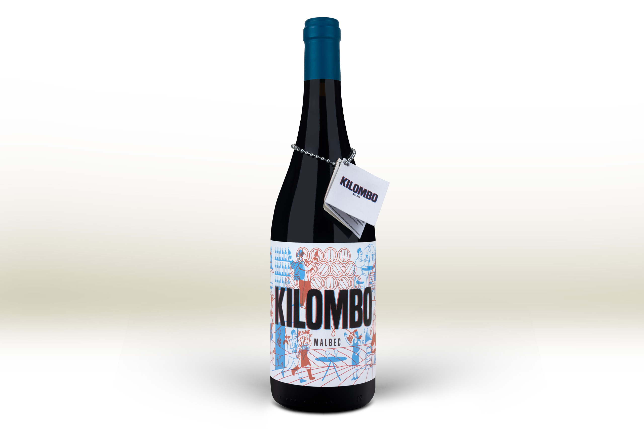
The Royal Spanish Academy defines a «Quilombo» as a "Commotion, hubbub, row, disorder". An expression that has helped us to create one of the labels that has caused us the most headaches, but whose final result has been truly spectacular.
The project, limited to 500 0.75cl bottles, was carried out for the Argentine winery Ejes de Autor, giving us the opportunity to go further in the creative process of designing a label.
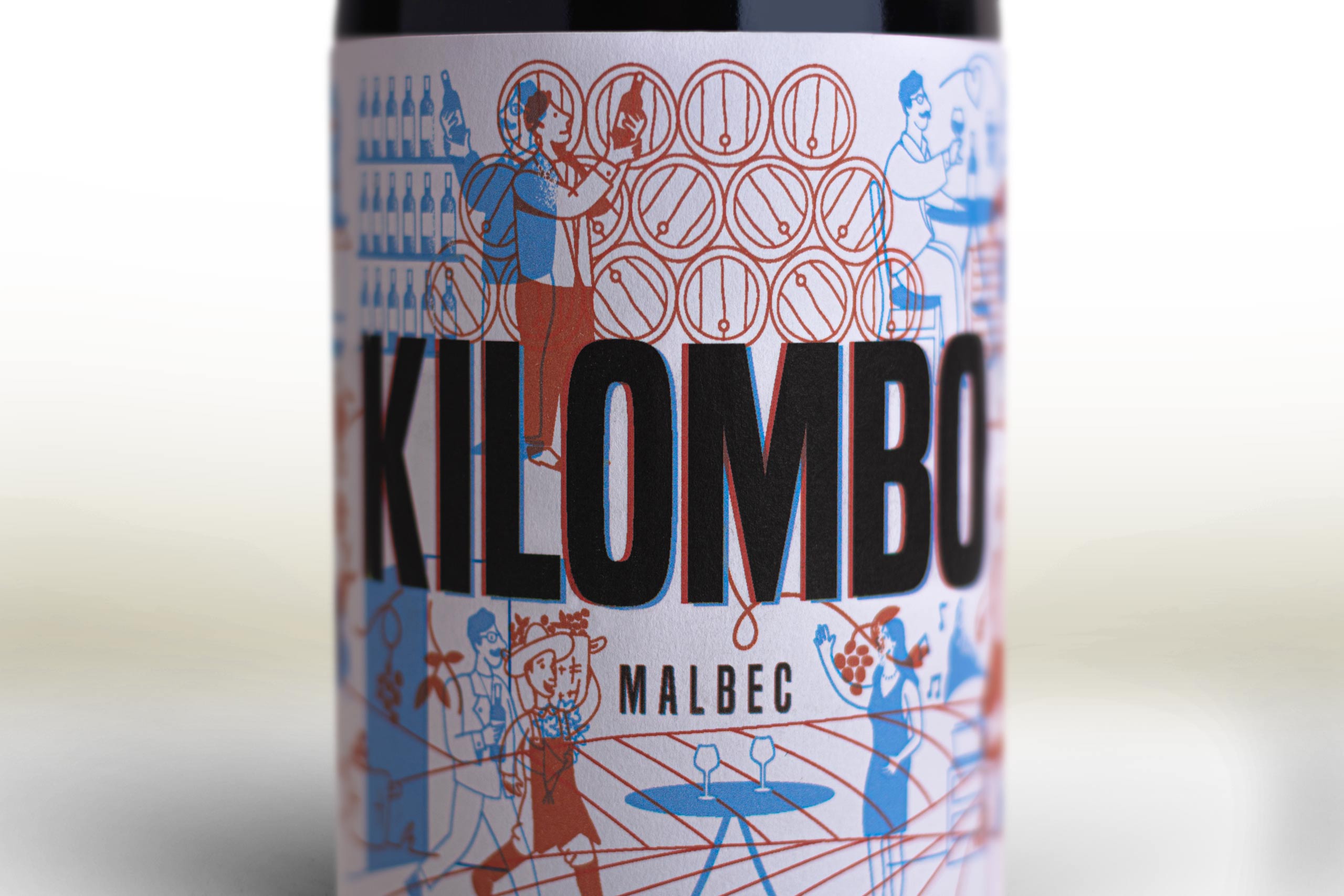
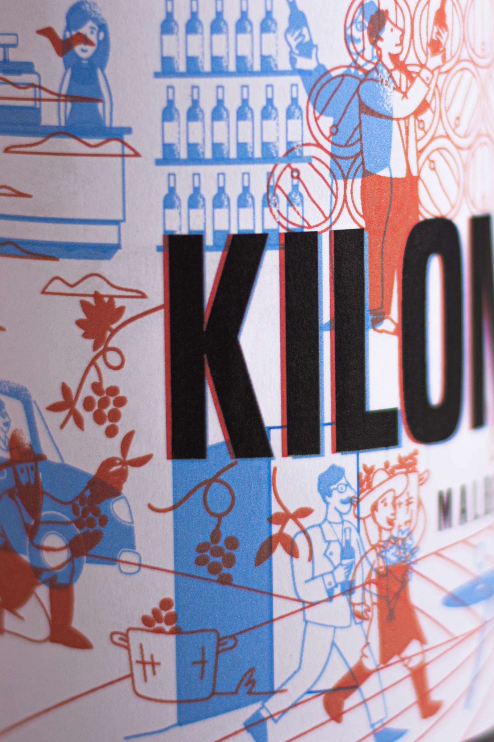
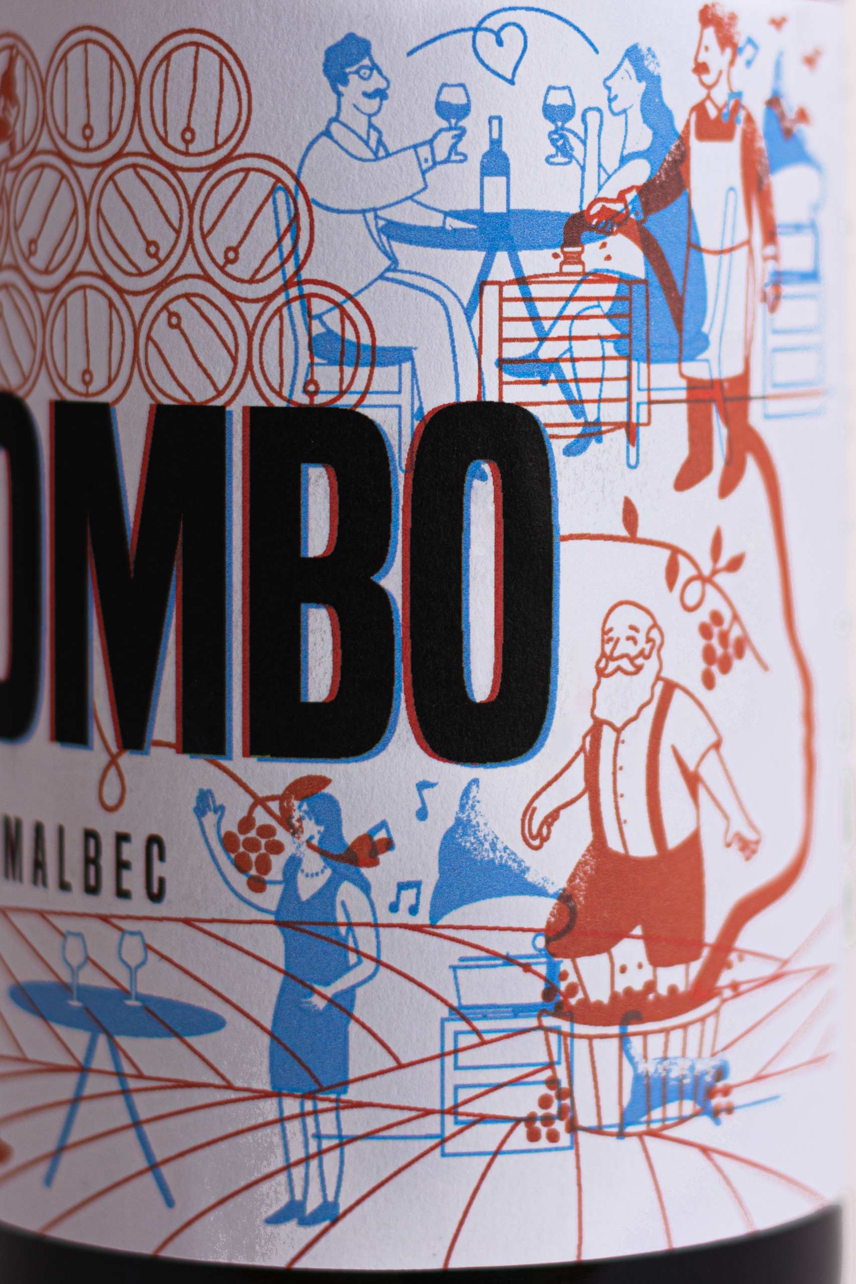
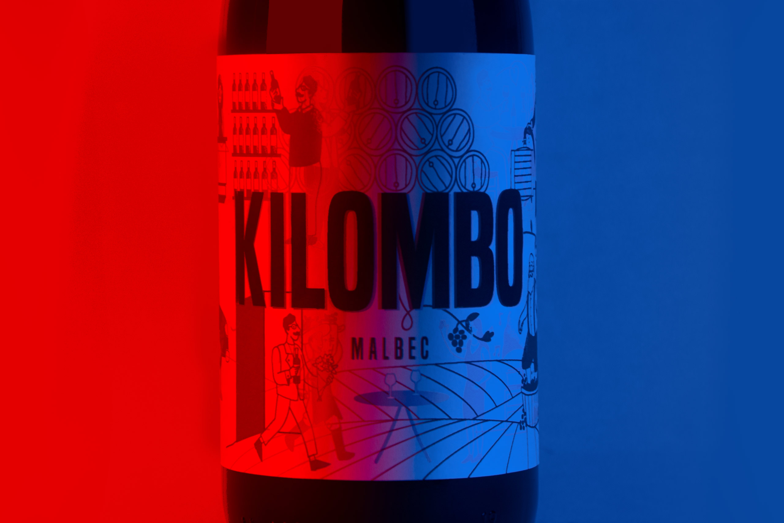
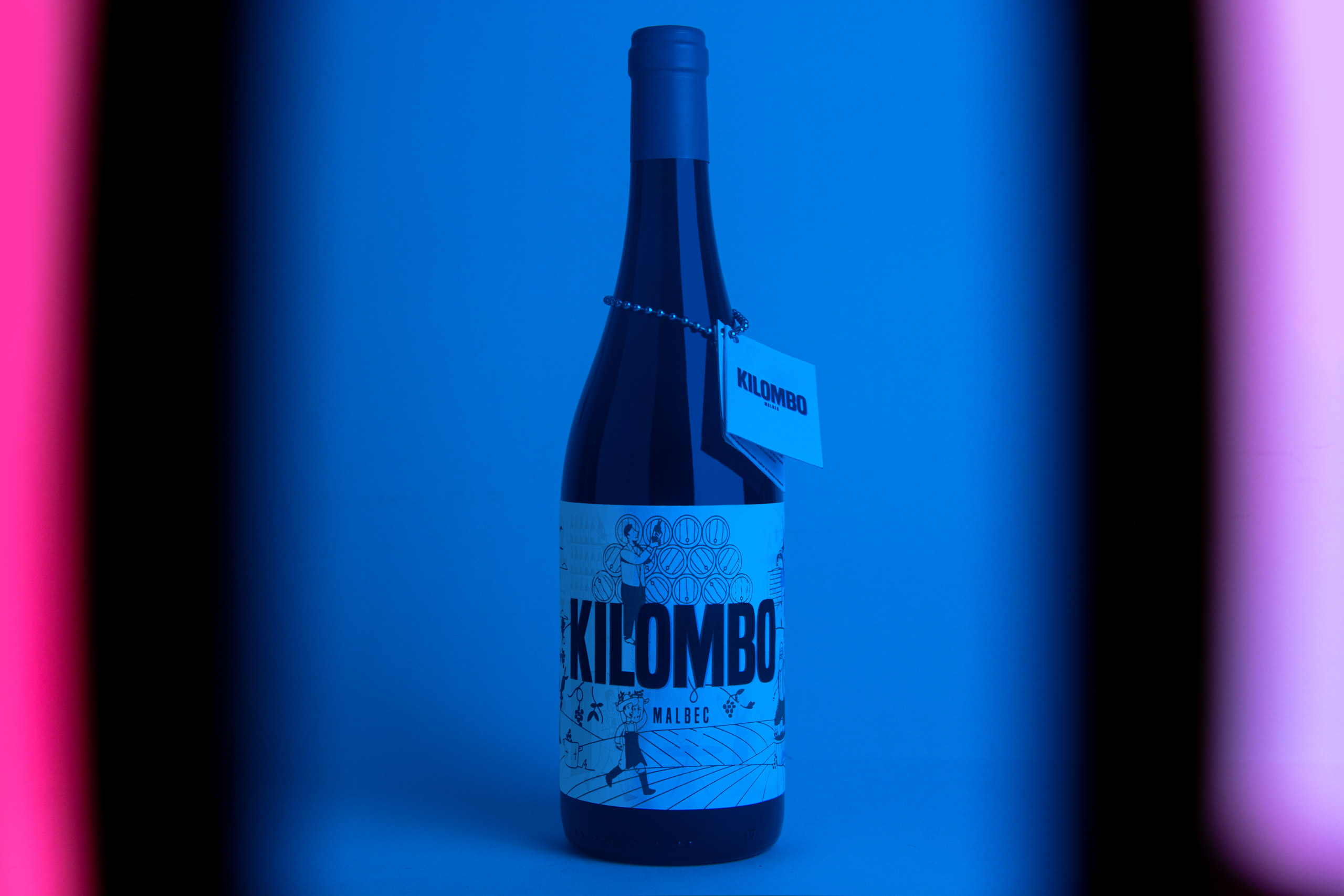
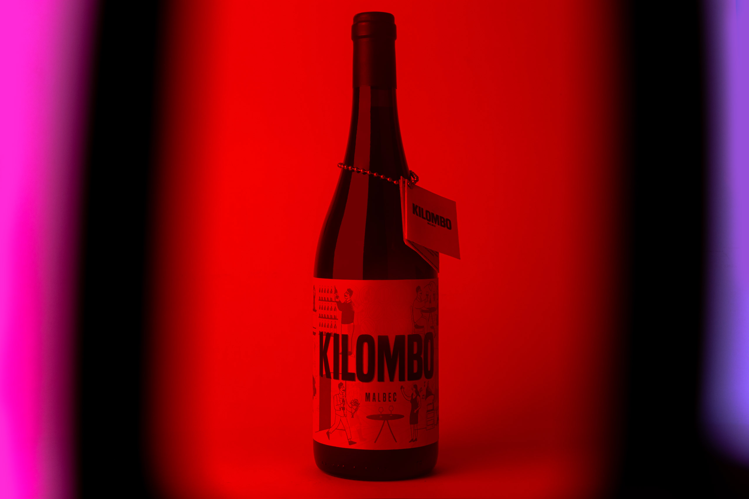
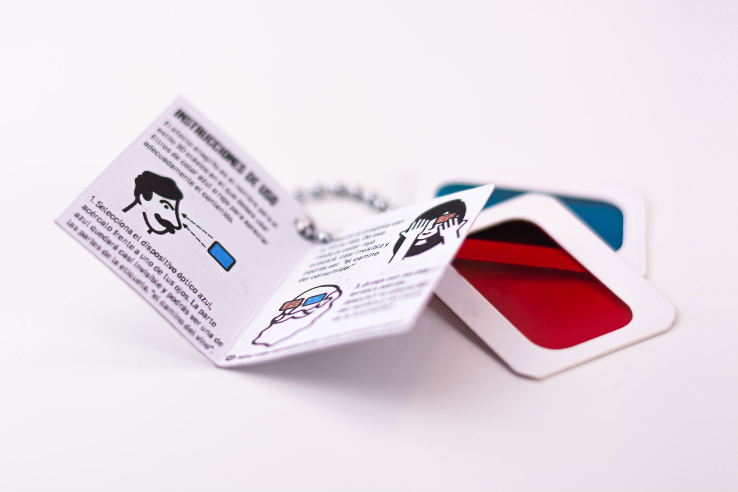
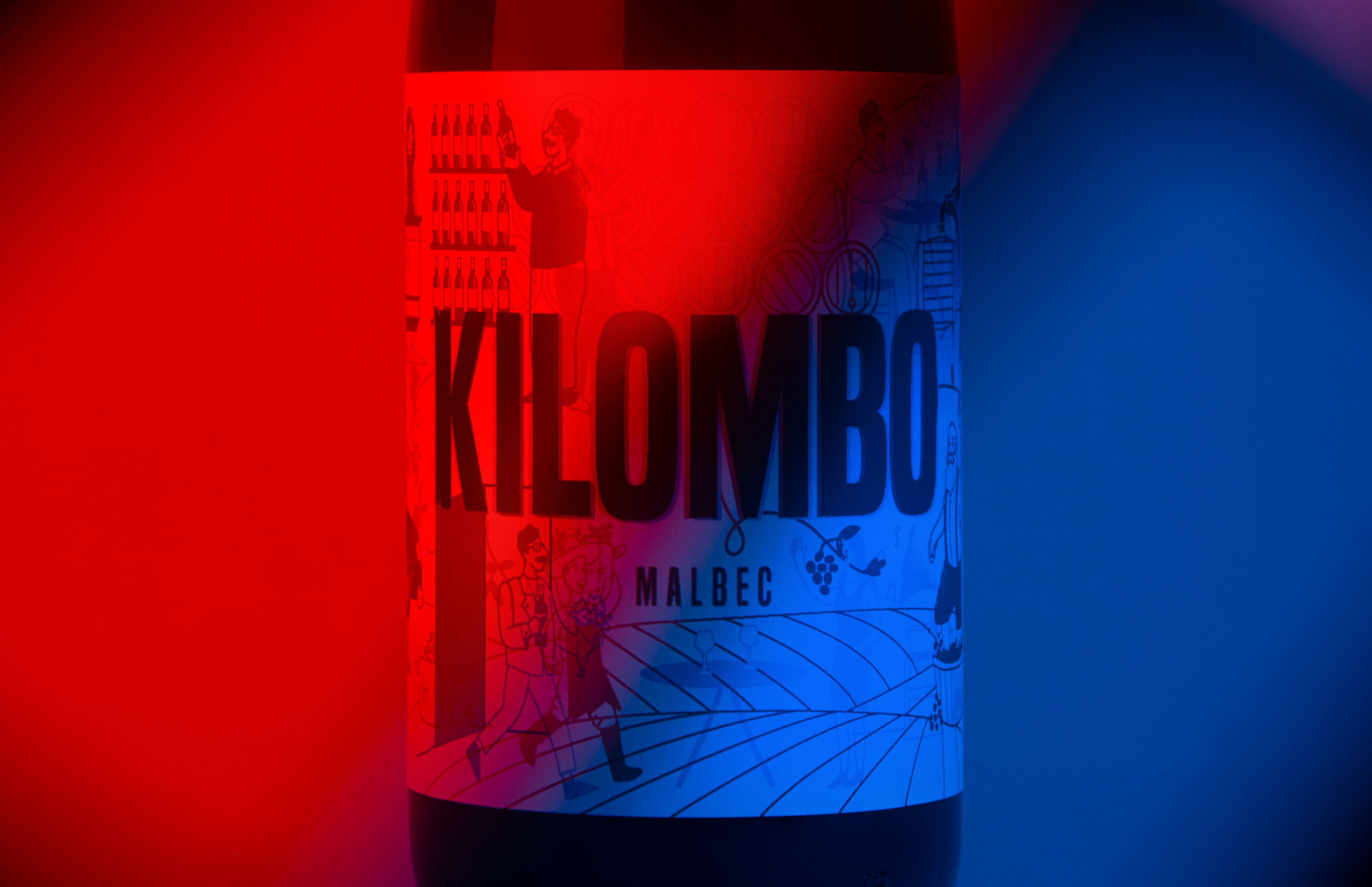
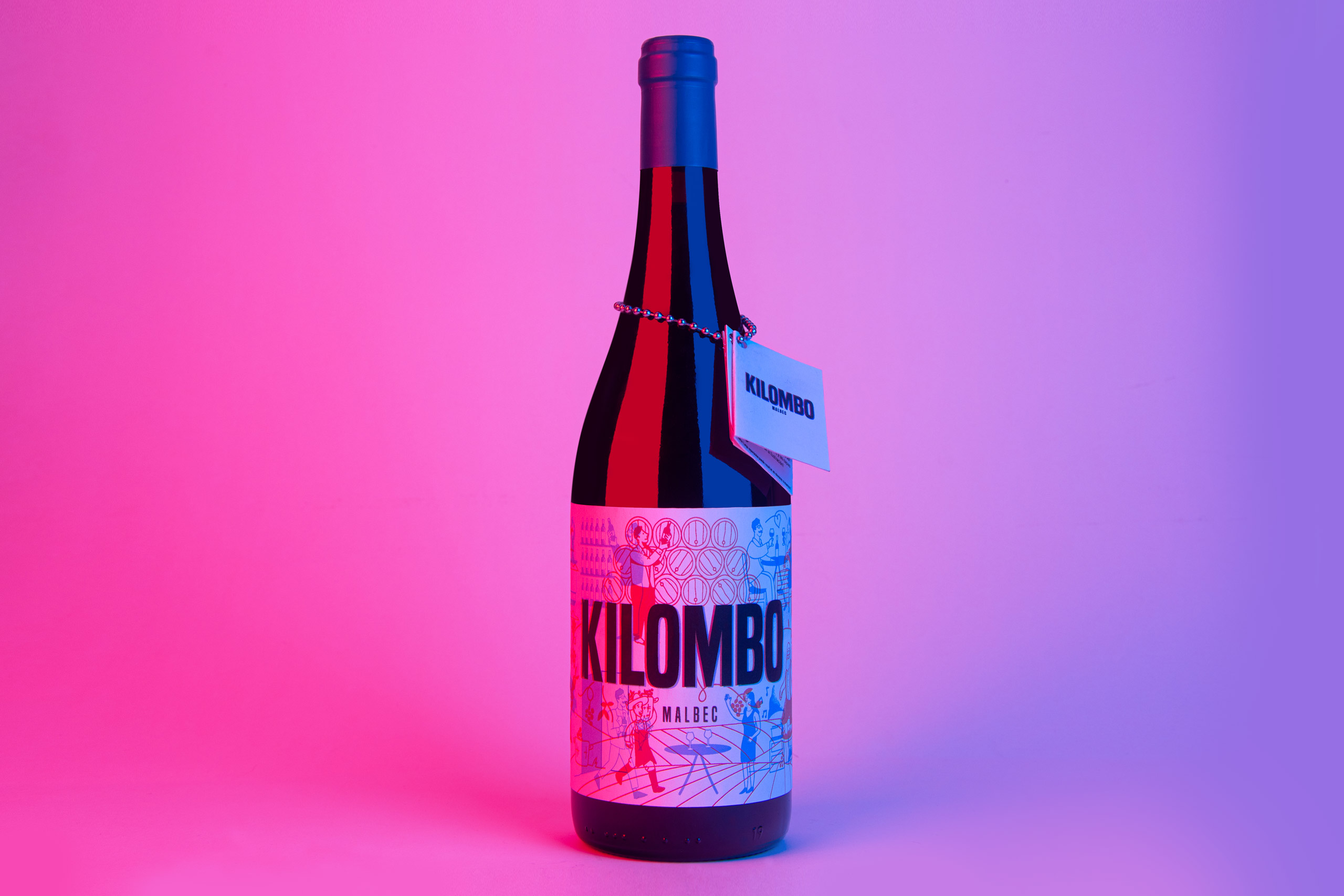
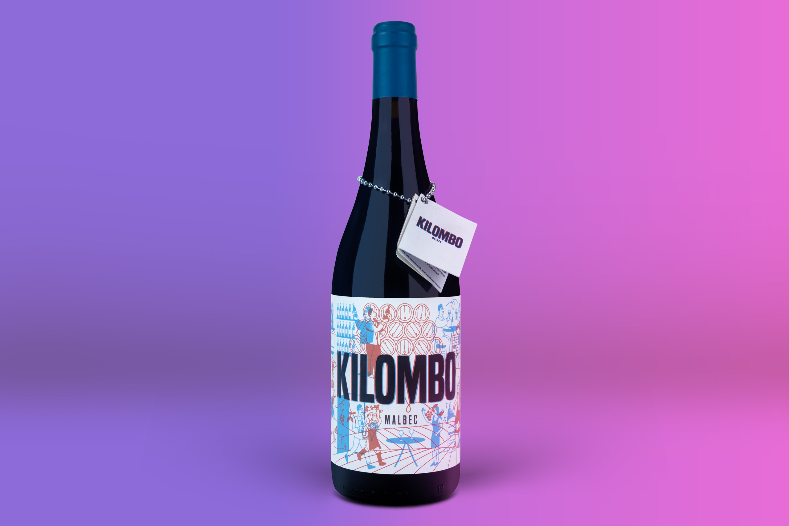
For this wine label, we used two-color anaglyphs and the feature of removing one of the colors using a lens of the same color as the ink used. In this way, we showed "the path of wine" in red, in which we narrated the creation of wine, and "the path of the consumer," which begins in the store and ends with the enjoyment of wine. Using one lens or the other allows you to enjoy the illustration without the interruption of the ink that remains on top.
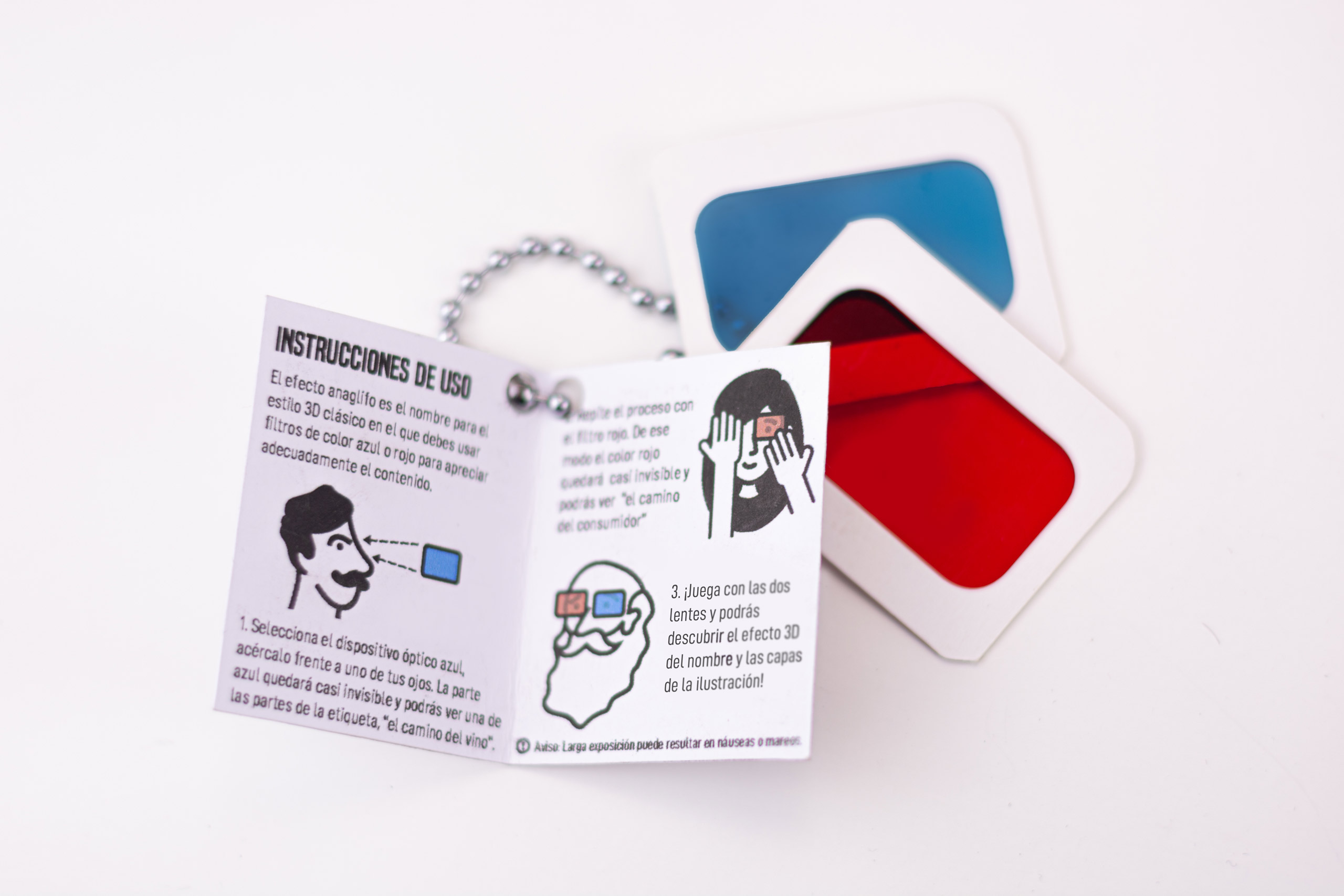
To complete the project, for which we also created the name, we designed a small booklet attached to the bottle that briefly explains the game that the label itself offers us.
Finally, using the two color filters allows you to see the name of the wine itself in 3D effect.