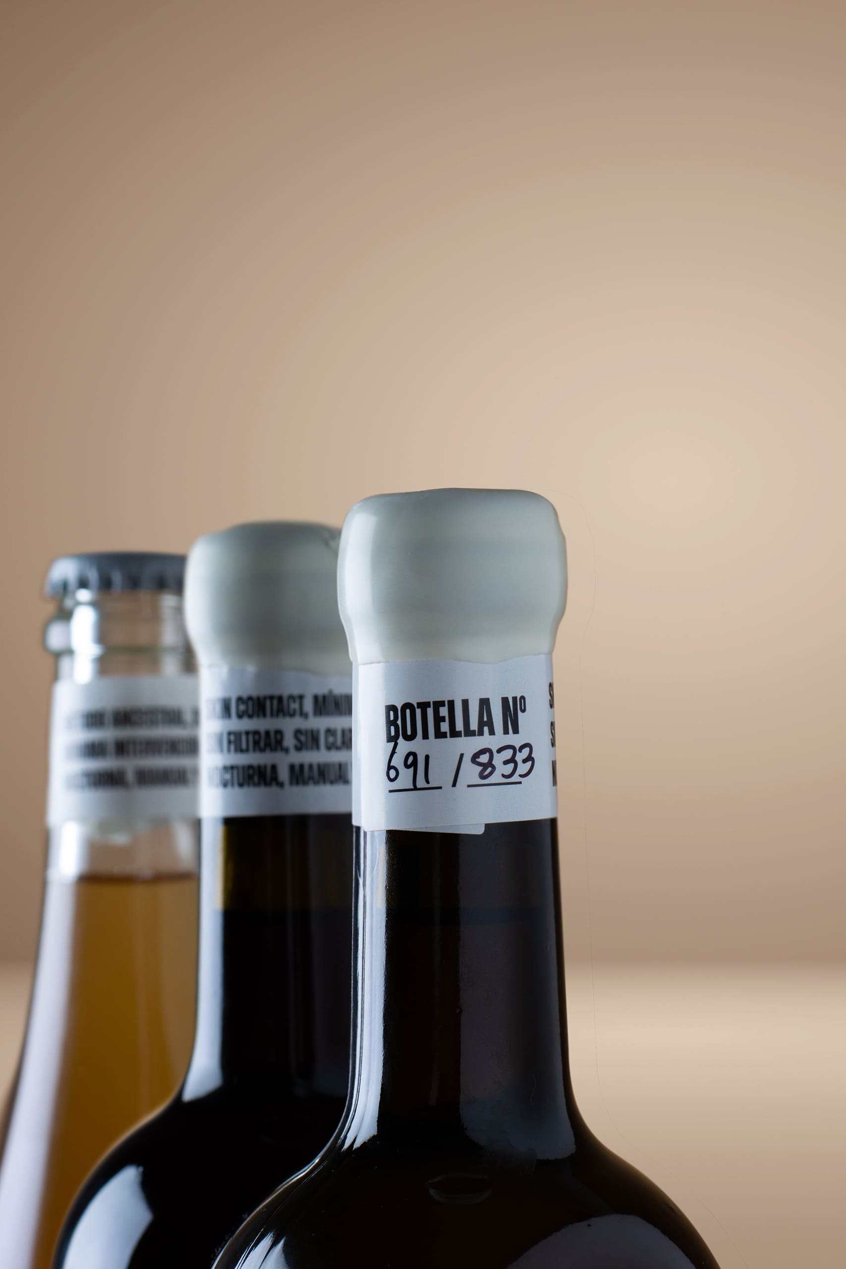
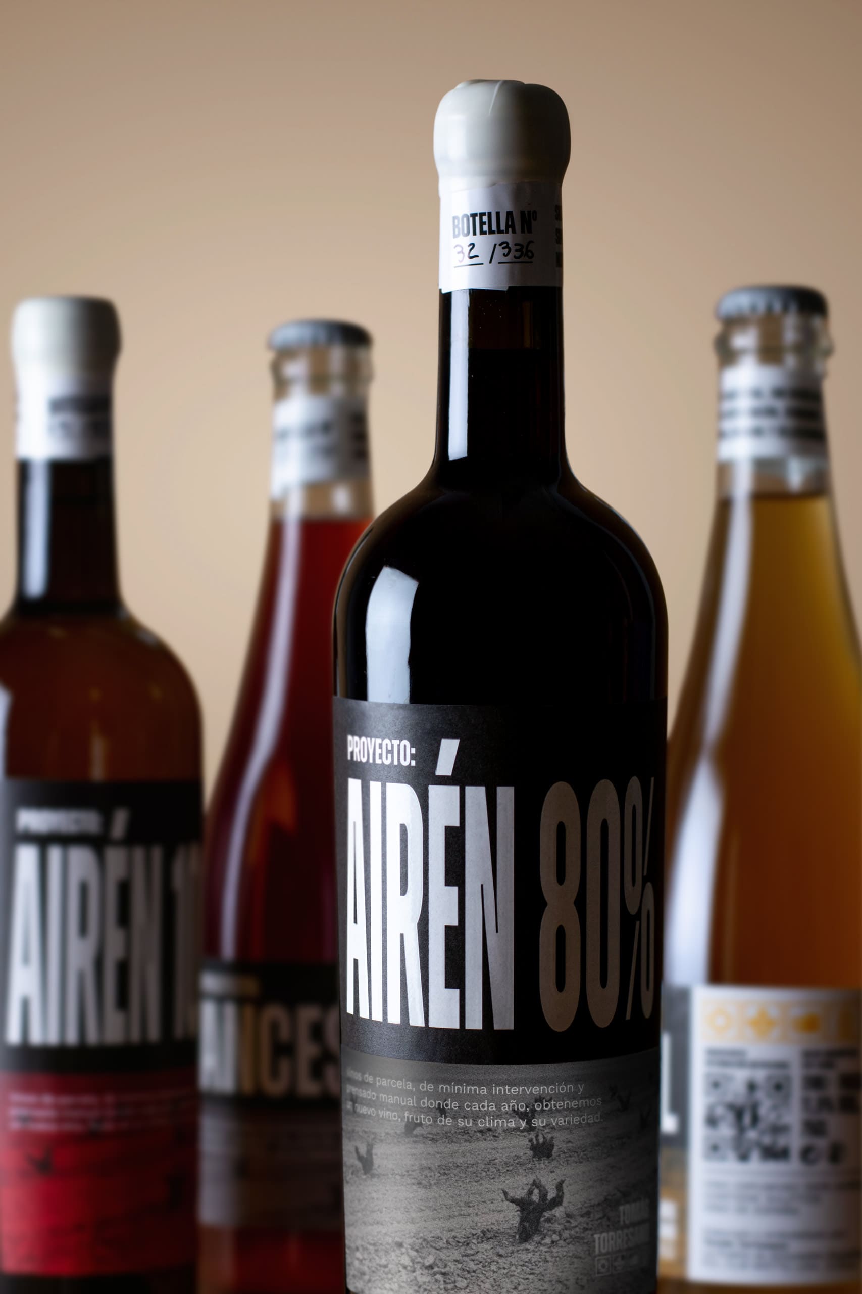
From Puebla de Almoradiel, in the province of Toledo (almost on the border with Cuenca), Tomas Torresano makes his wines slowly and with self-taught knowledge that is astonishing given how quickly he has been able to learn and the quality of all the wines he produces.
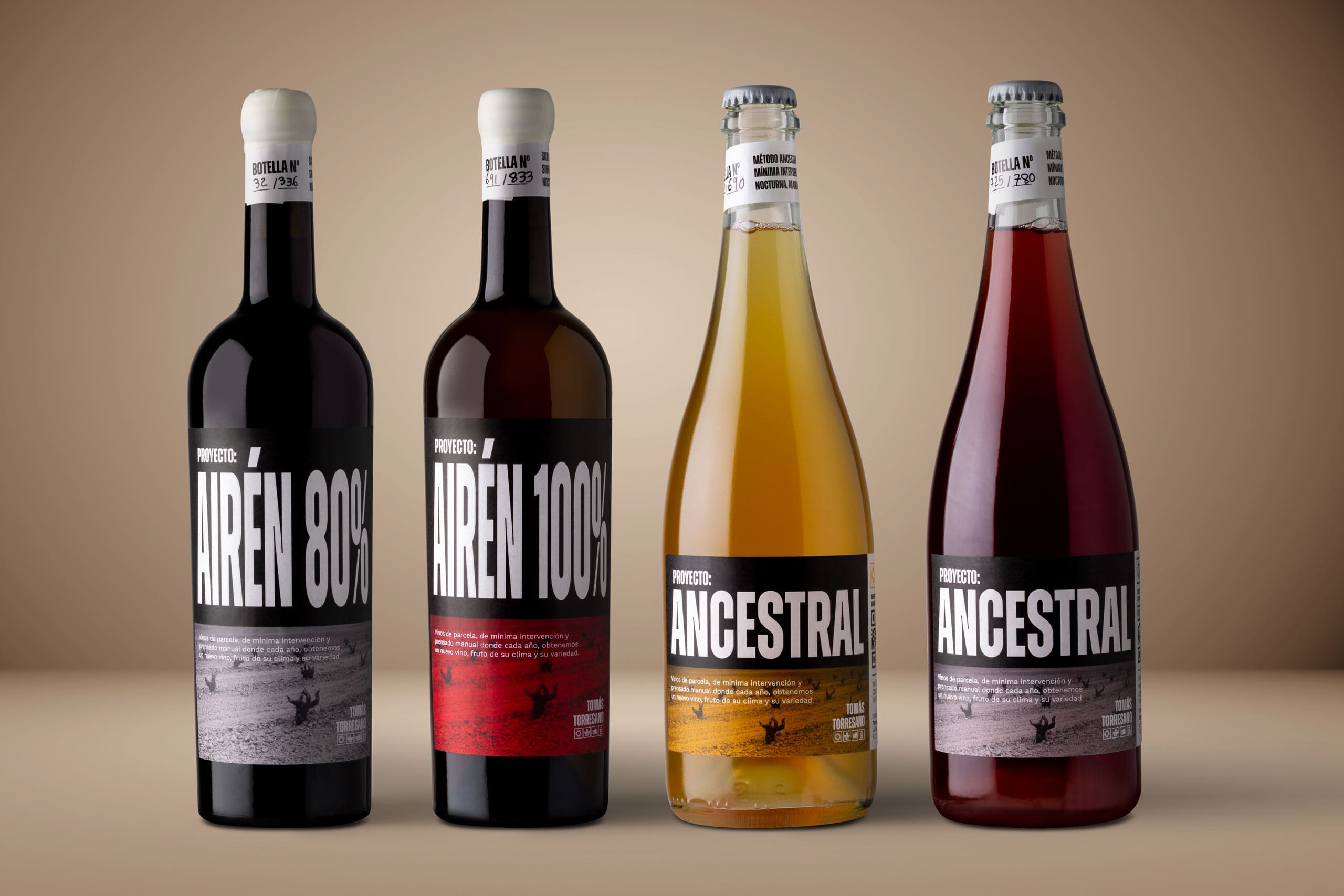
A seemingly simple personal branding project transformed into a company that we completely redesigned, both in terms of identity and subsequently in the design of its two wine ranges.
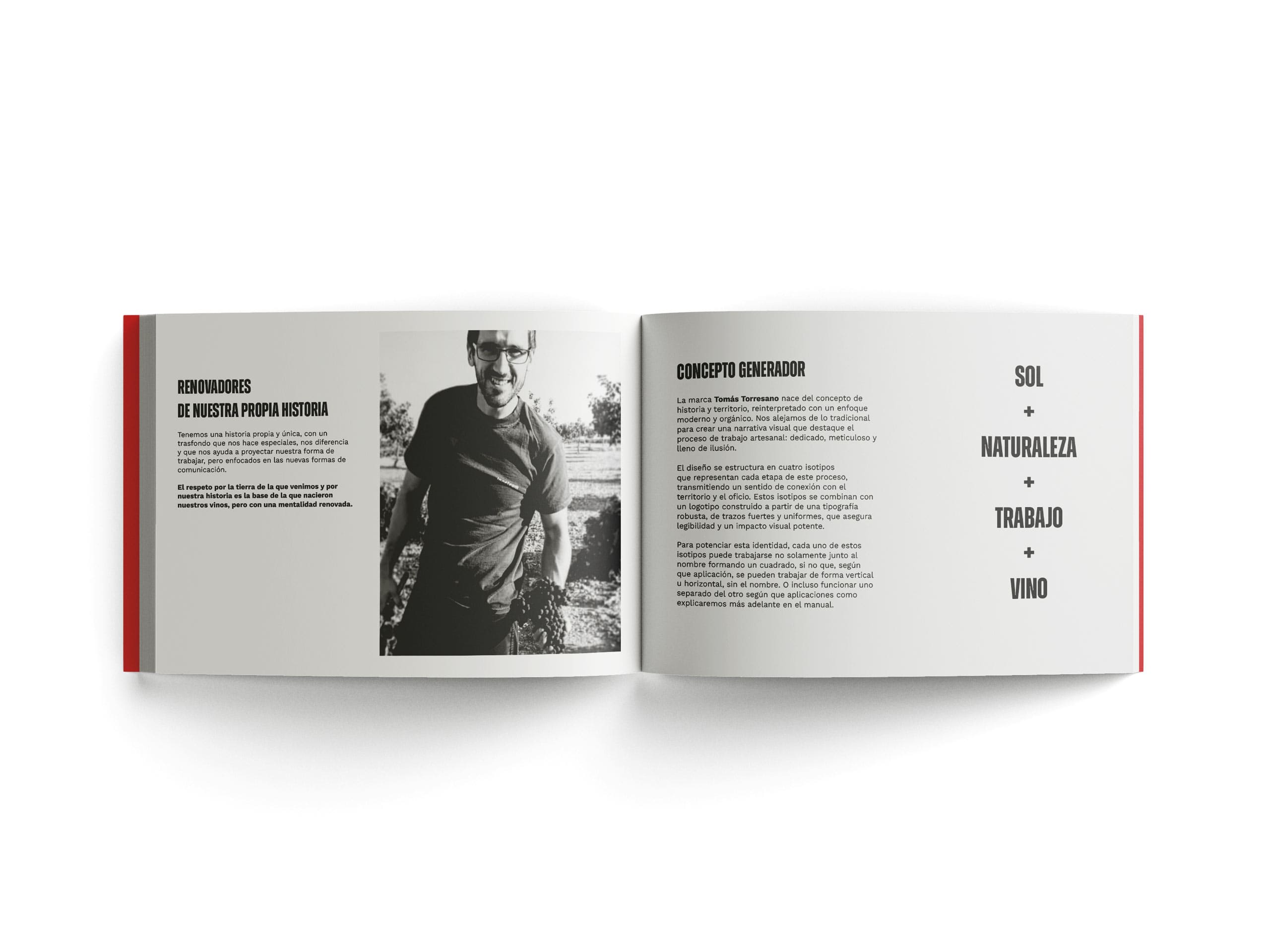
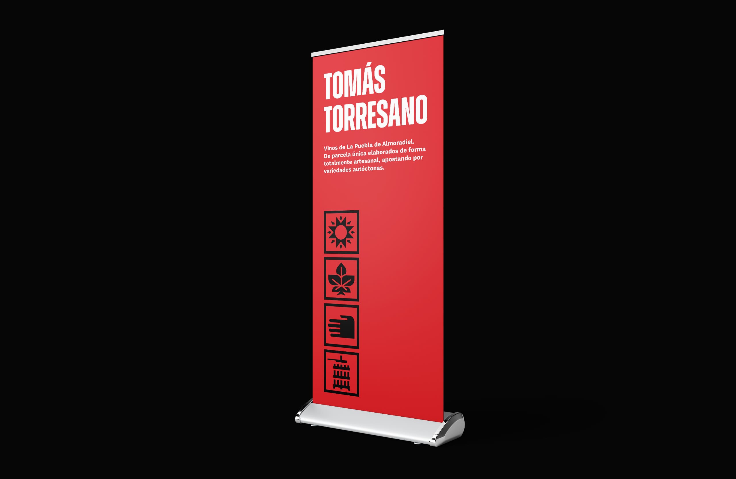
As we always do when we start a project, we interviewed Tomás in his village and got to know his environment to see exactly what defined him and try to convey this in a solid, durable brand that would help him in his commercial and positioning strategy.
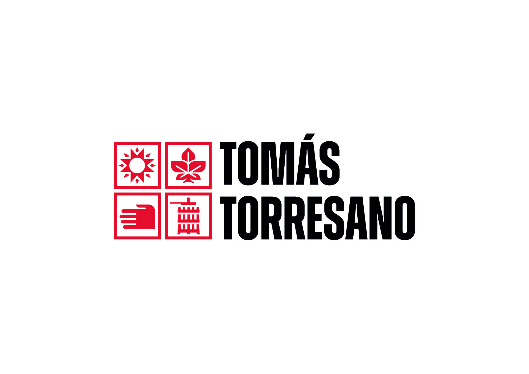
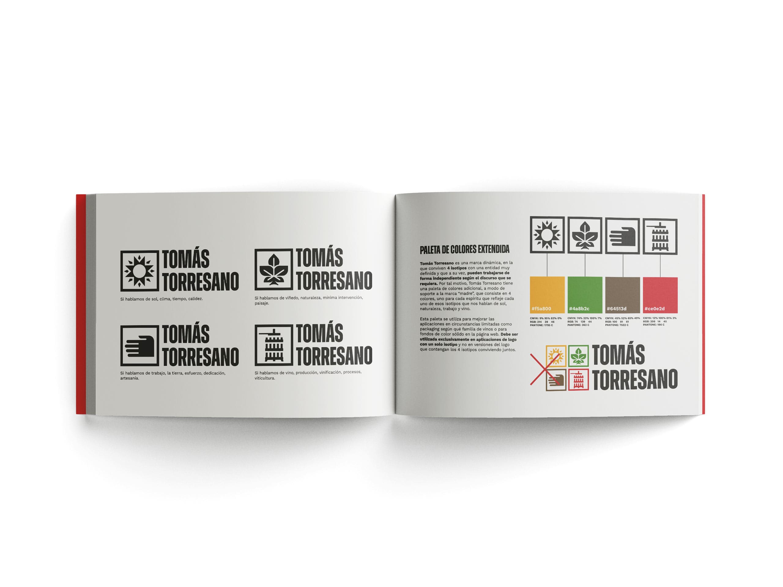
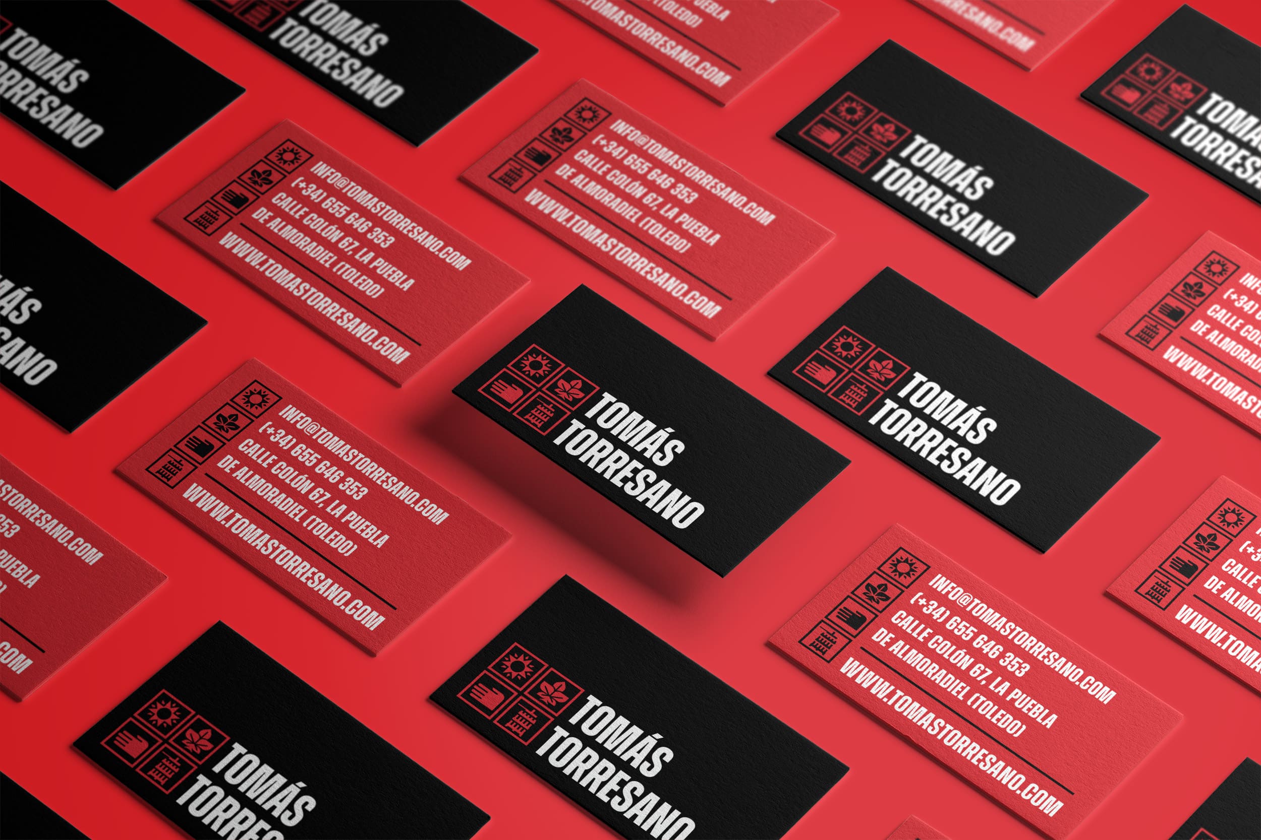
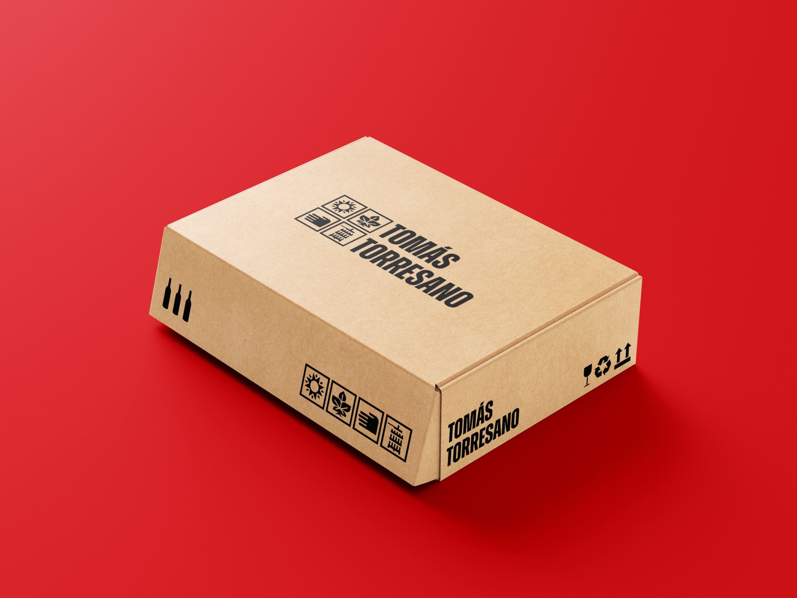
Descubrimos un proyecto completamente horizontal donde el trabajo de campo queda definido en cuatro iconos que diseñamos como transmisores de esos cuatro puntos que definen el trabajo de Tomás: Clima – Naturaleza – Trabajo – Vinificación.
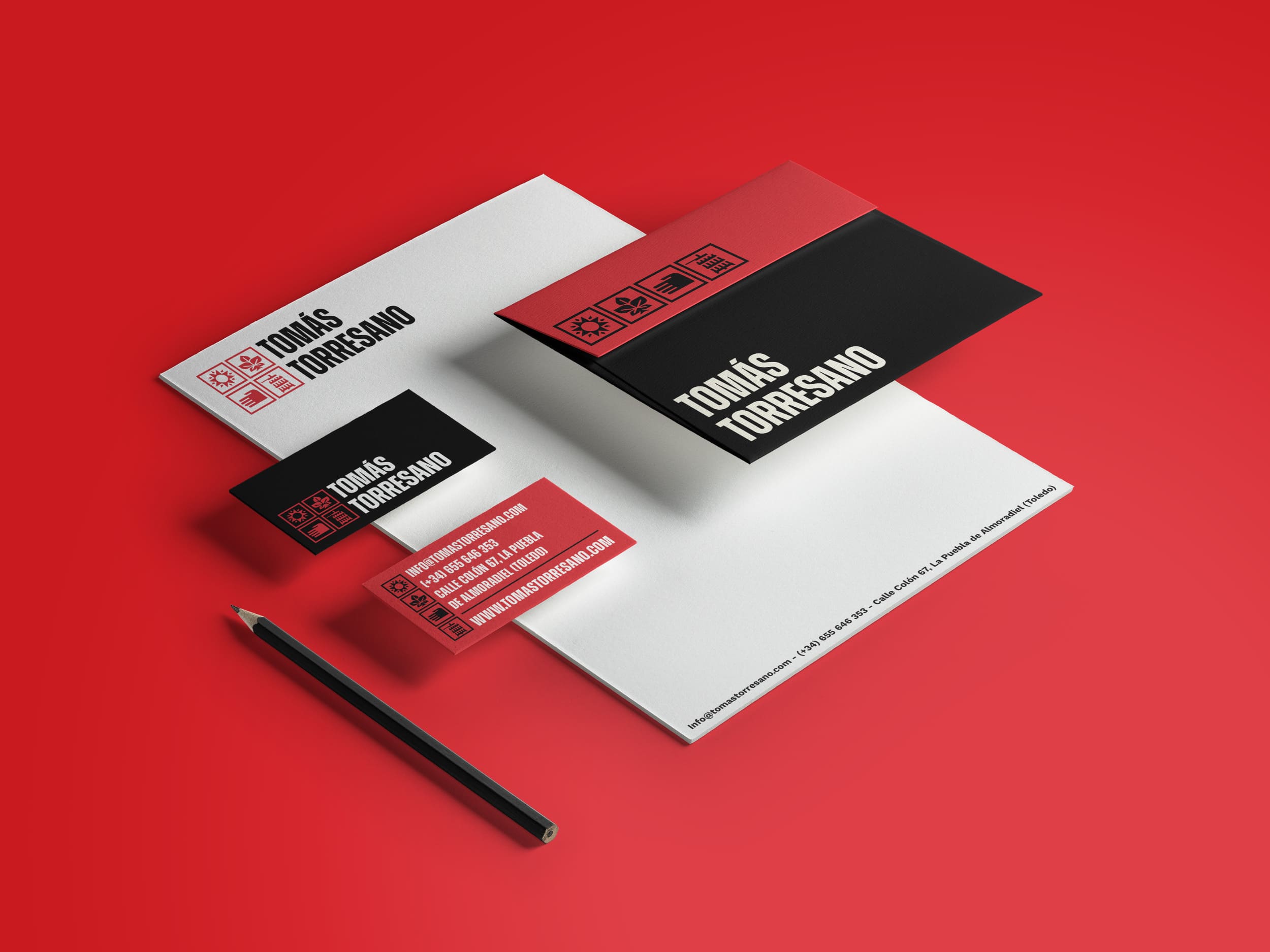
A bold, robust letter accompanied by a vivid red color as the main tone, although always with the possibility of changing and transforming into another tone and shape inspired above all by Tomás' flexible personality, where each wine is a symbol of its vintage and processes, and may vary from year to year.