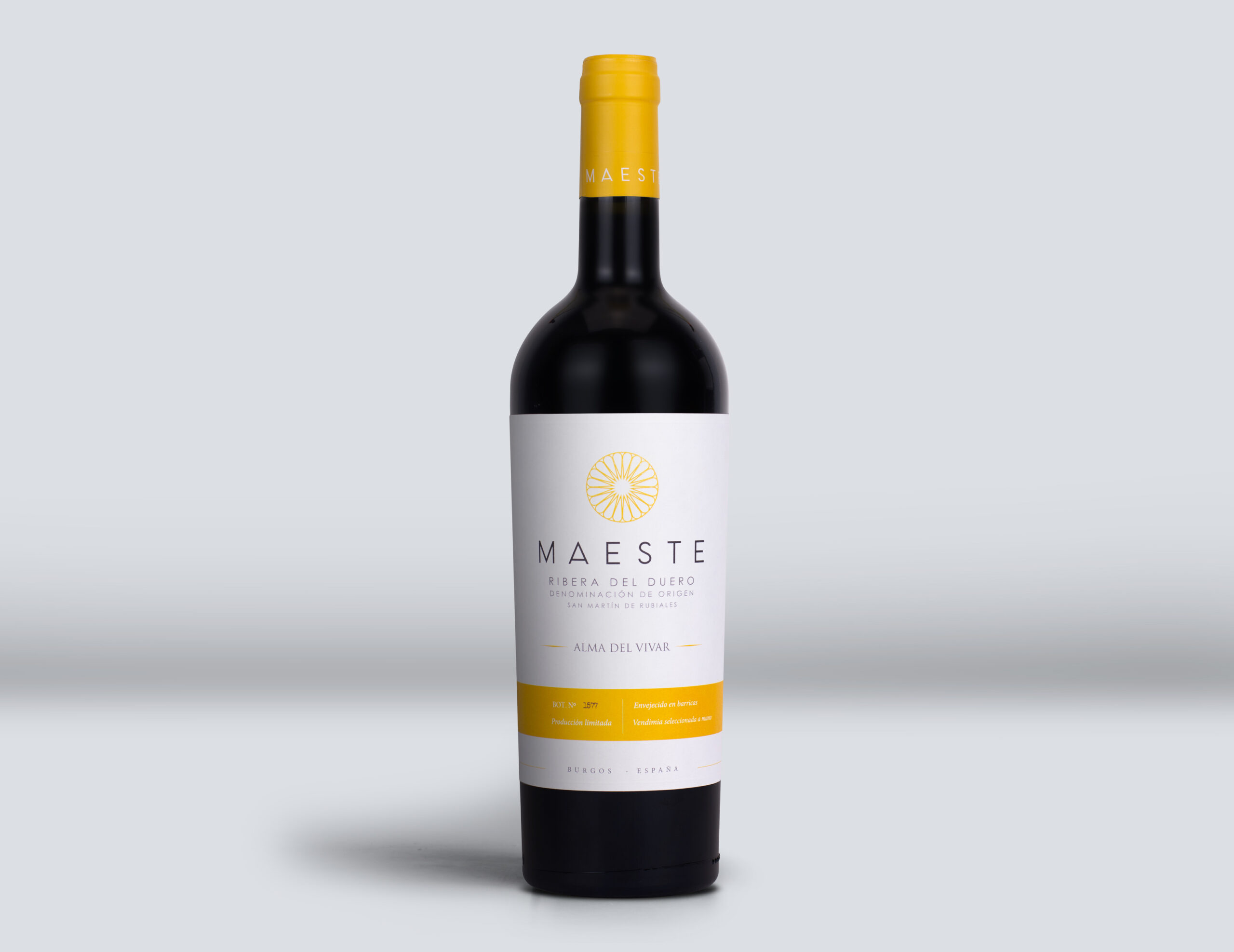
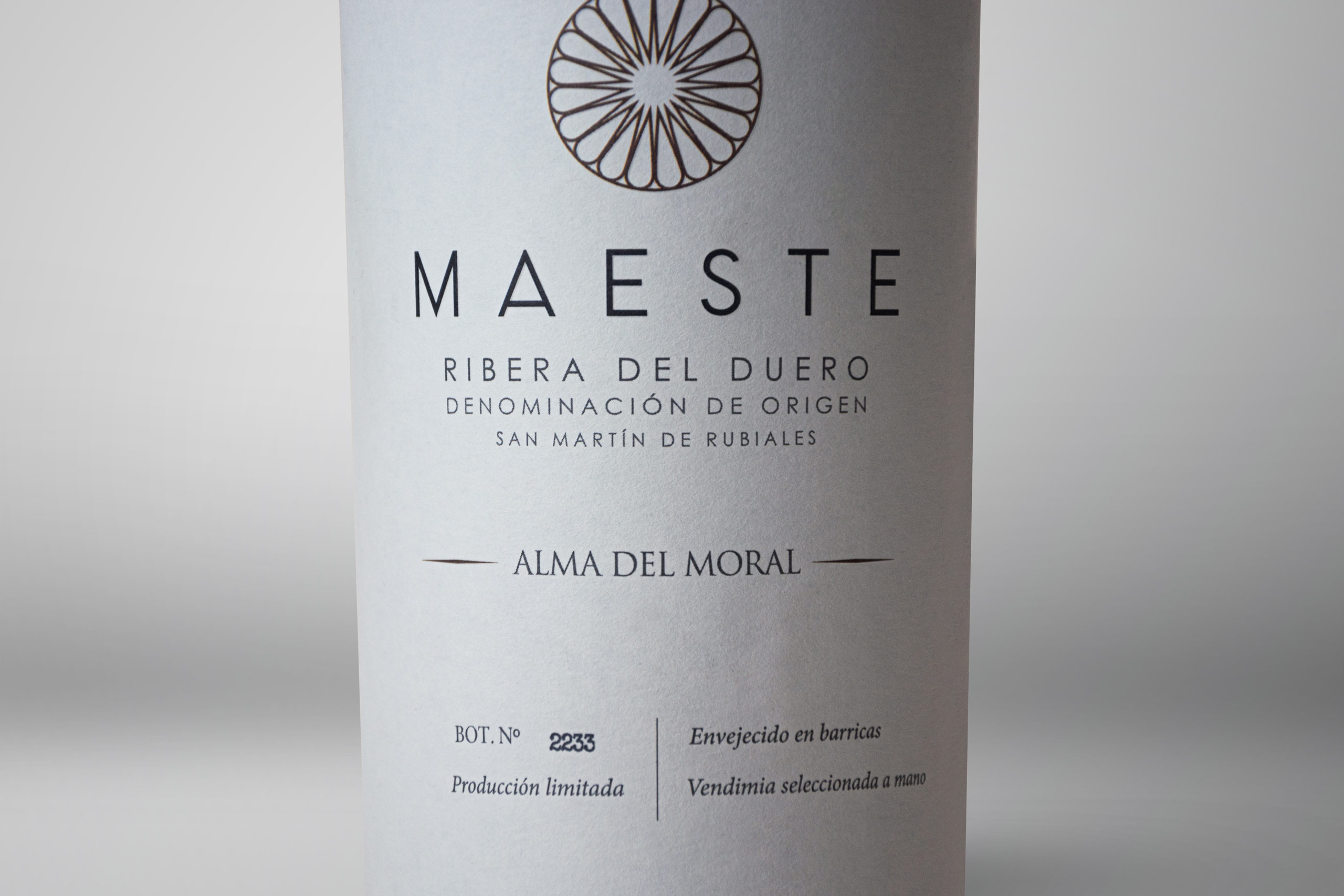
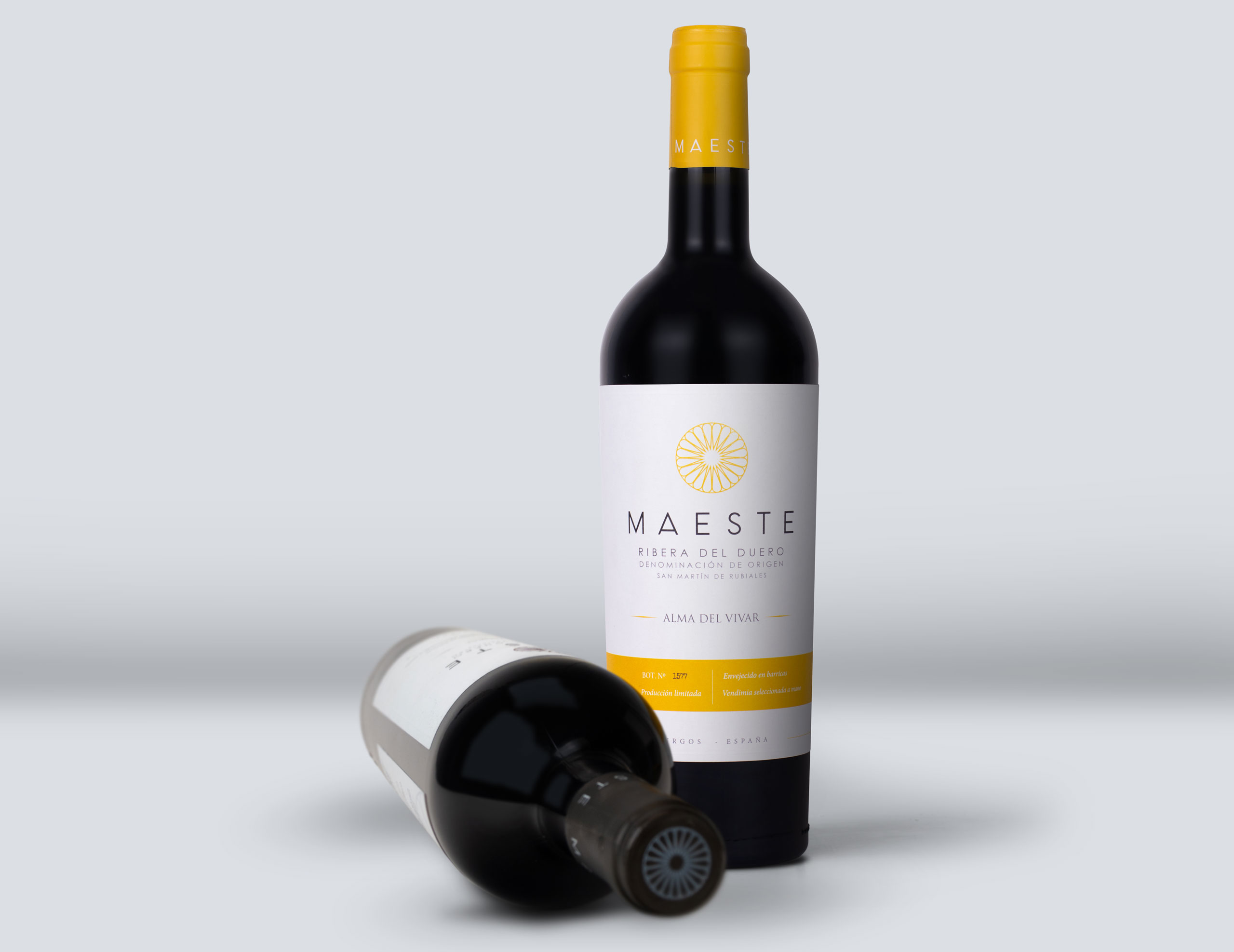
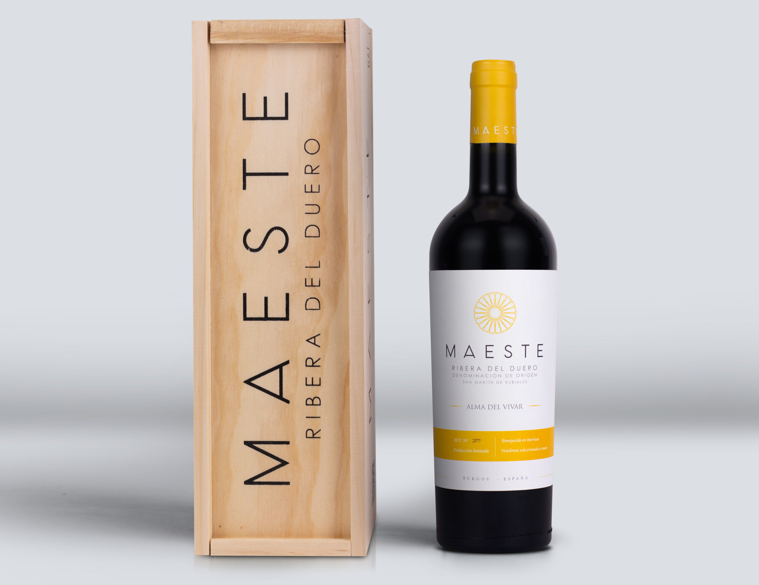
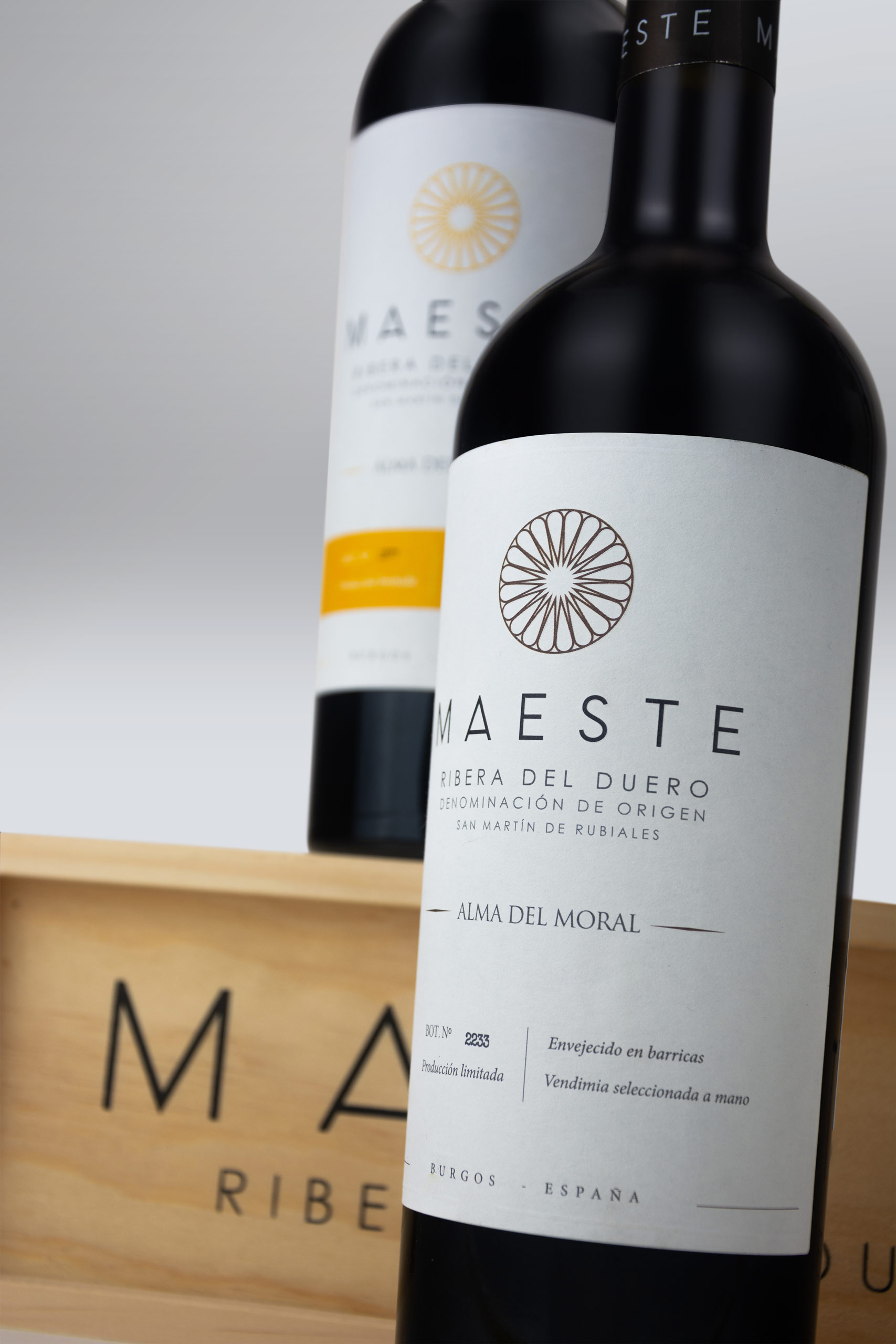
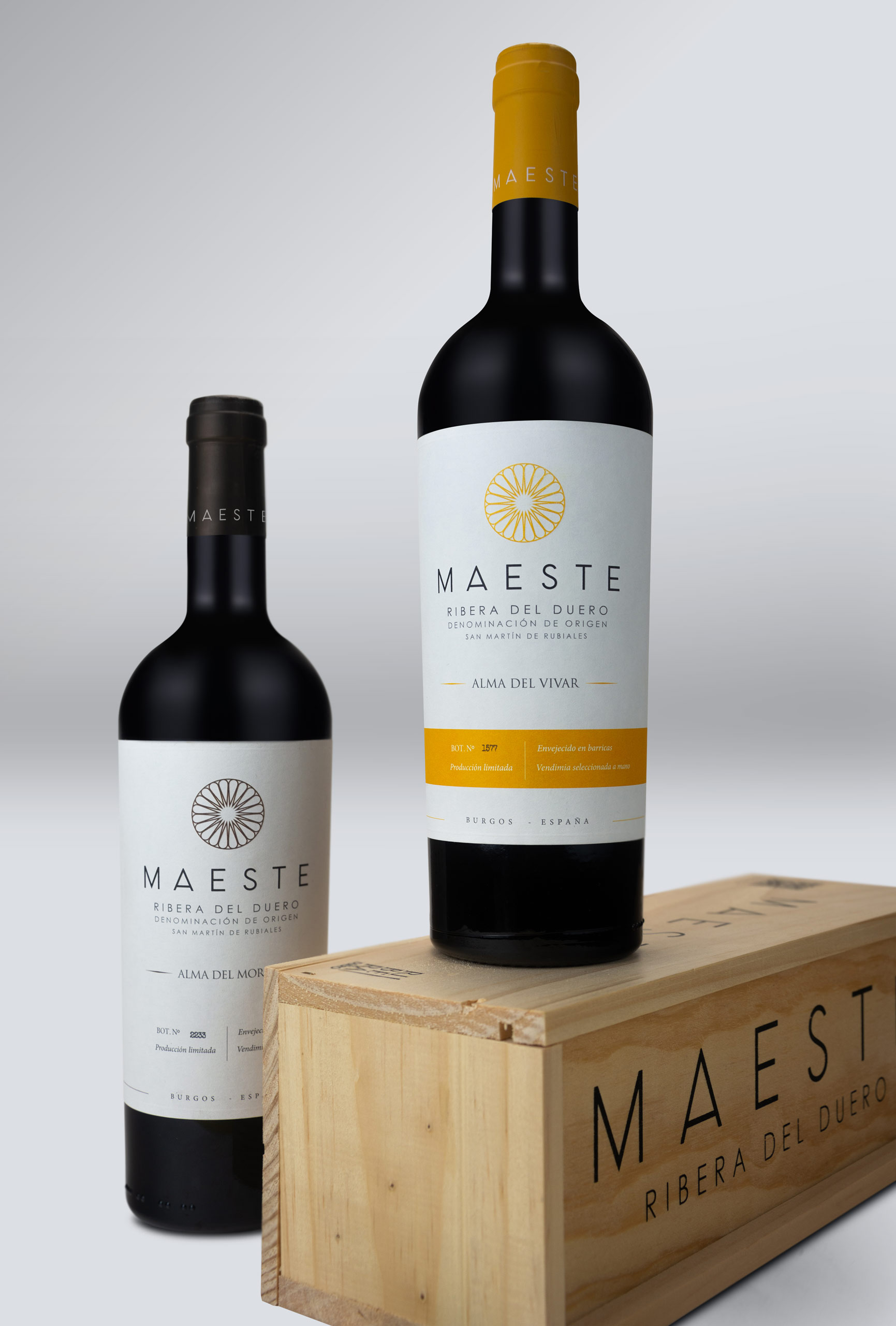
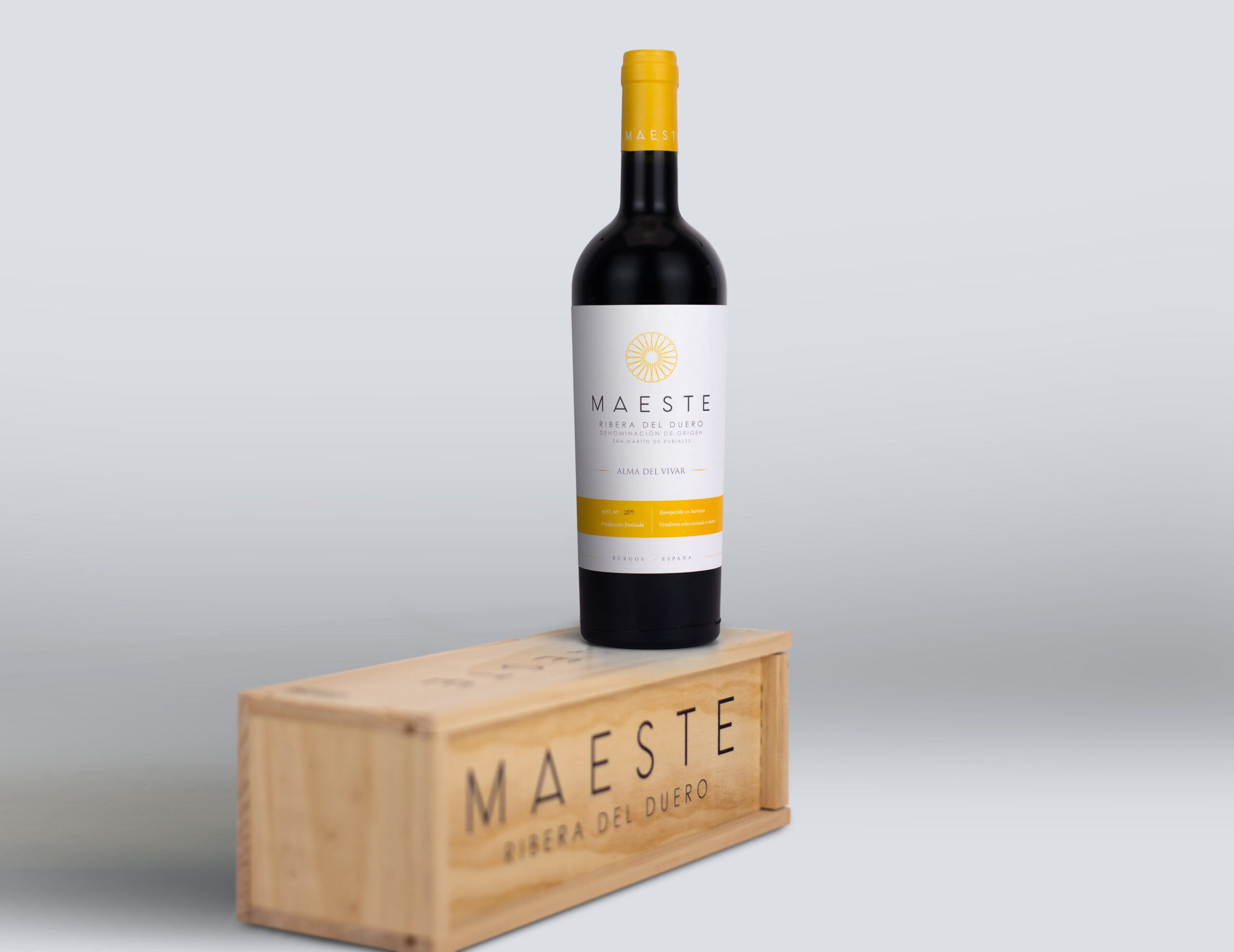
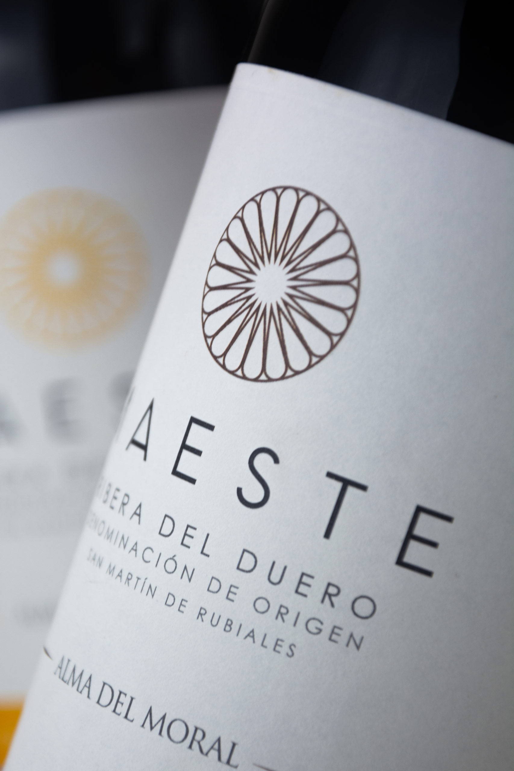
Within the brand creation project for Bodegas Maeste, one of the most notable tasks was the creation of its two references: Alma del Vivar and Alma Del Moral. This task alone was decisive in conveying the entire brand creation process, which you can see here.
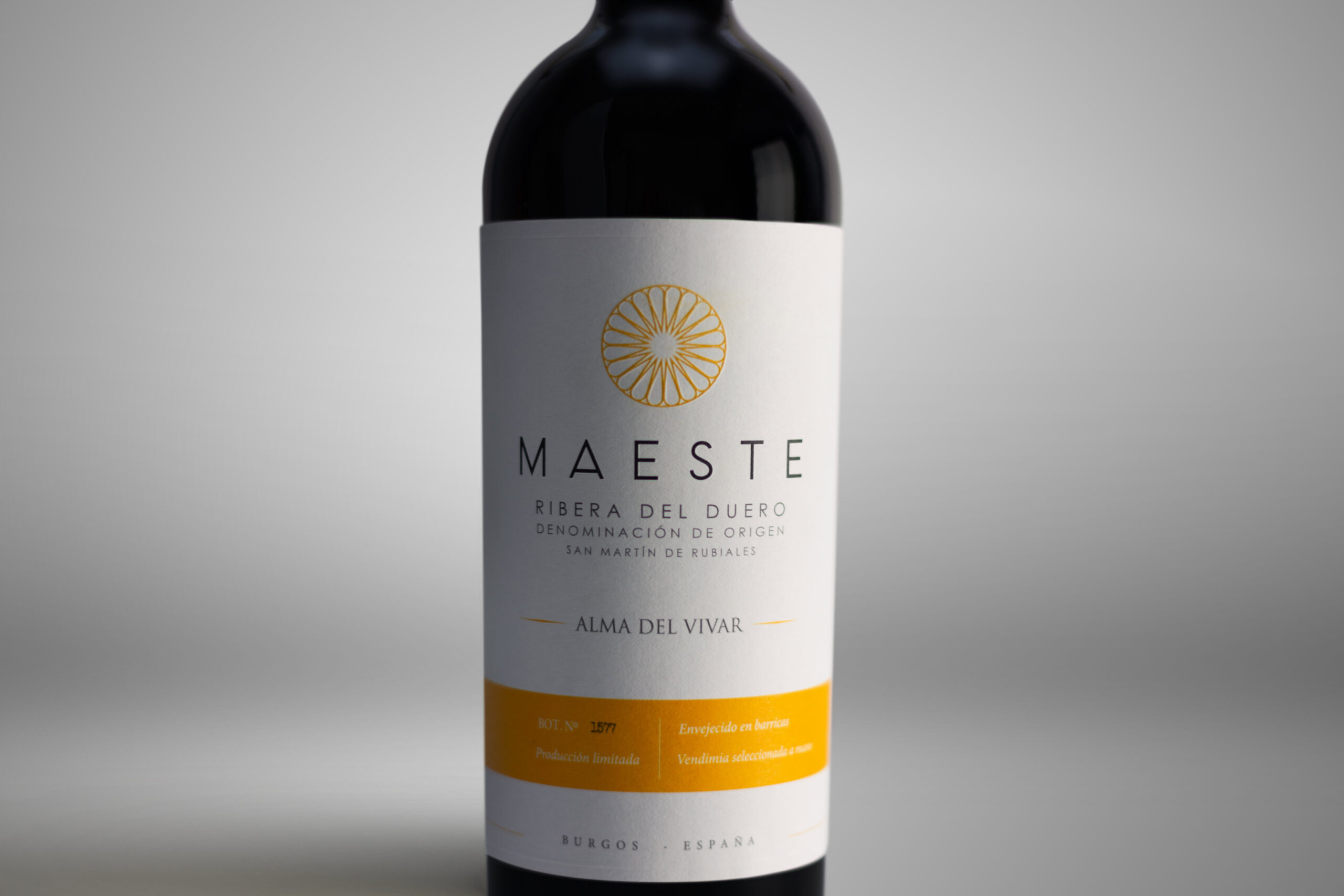
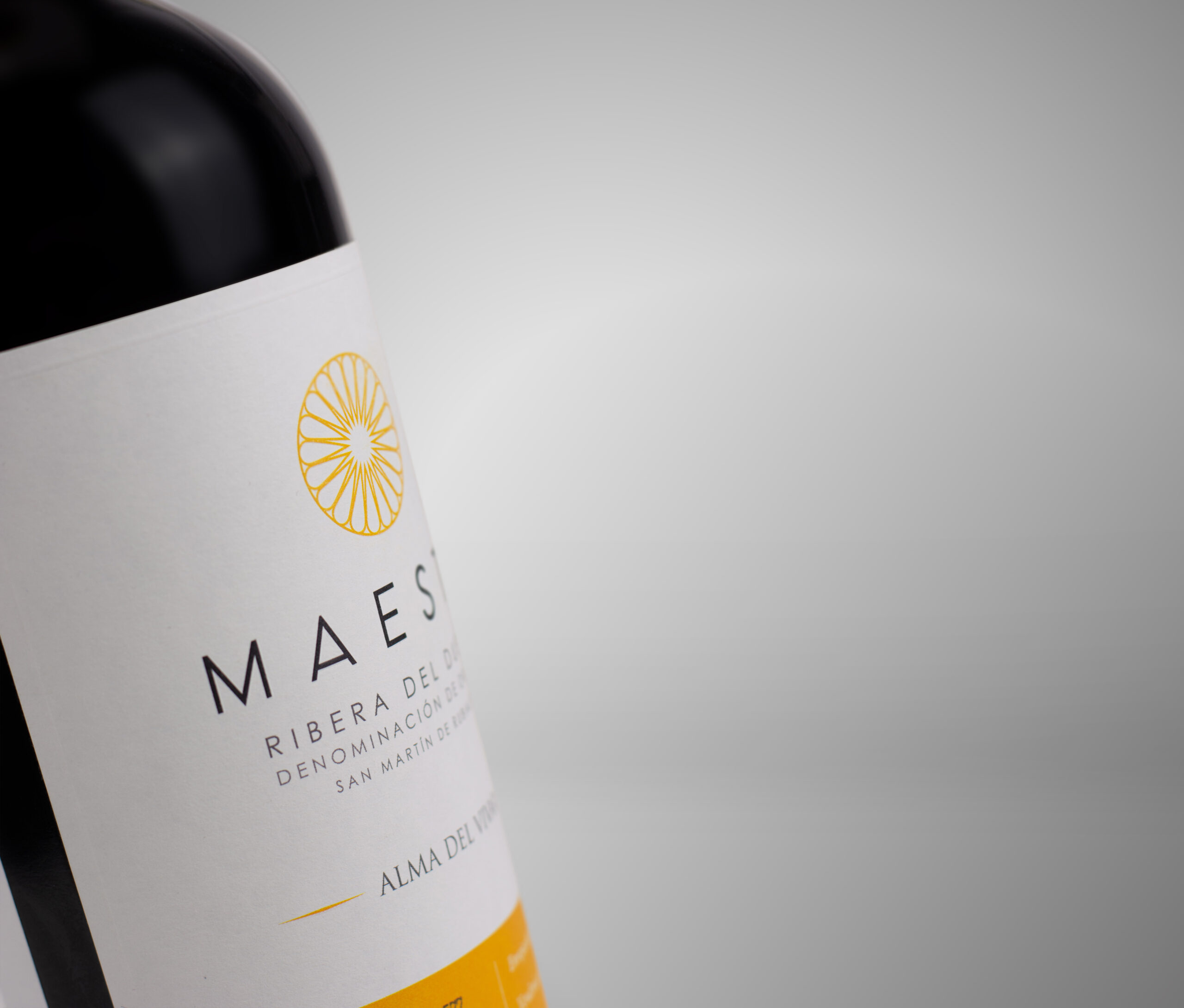
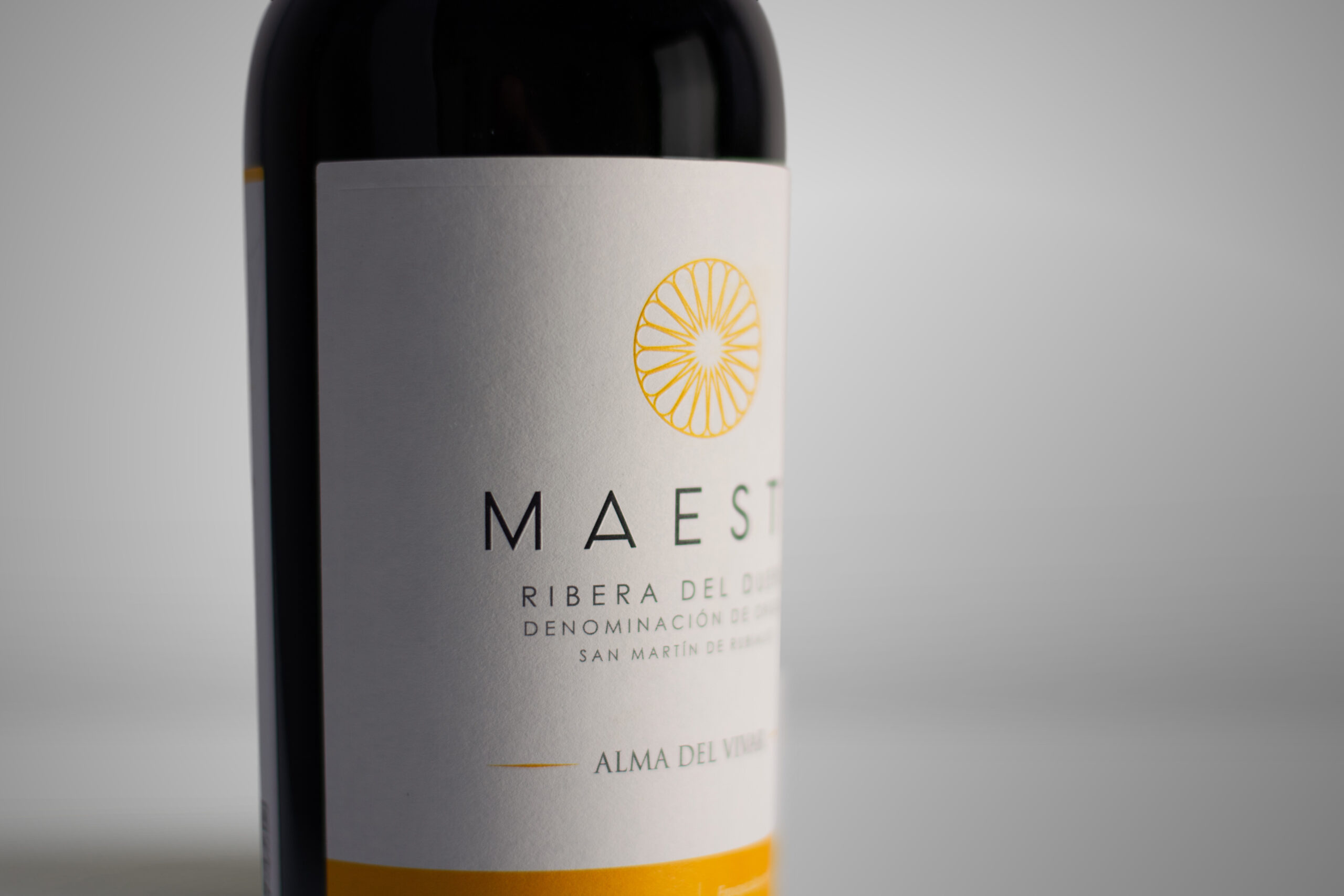
After creating the entire brand and its manual, we realized that the wine label design had to reflect the unique character of Bodegas Maeste: A design with a clear identity, using the brand's main color, a mustard yellow that would bring liveliness to a label that, due to the wine it contained and all the strategic work we had done previously, had to be sober.
We chose a cotton paper with good thickness and texture that emphasized the few effects of the bottle, subtle reliefs without varnish to create a bottle with the characteristics we were looking for: one that was sober and elegant without being "stuffy," one that could be immediately associated with top-of-the-range wines due to its design, and one that would stand out on any shelf.
The result is aesthetically very beautiful and, as could not be otherwise, perfectly defines the brand itself.